Correlation in R: Pearson & Spearman with Matrix Example
A bivariate relationship describes how two variables change together. Correlation is one way to quantify this relationship.
Two widely used correlation measures are:
- Pearson correlation: measures linear association (parametric).
- Spearman correlation: measures monotonic association using ranks (non-parametric).
Pearson correlation
The Pearson correlation coefficient (often denoted \(r\) in samples) measures the strength of a linear relationship between two variables \(x\) and \(y\):
\[ r = \frac{\mathrm{cov}(x,y)}{s_x s_y} \]
where \(s_x\) and \(s_y\) are the sample standard deviations of \(x\) and \(y\).
The correlation ranges from \(-1\) to \(1\):
- values near 0 indicate little or no linear association,
- values close to 1 or -1 indicate strong positive/negative linear association.
A common test for \(H_0: \rho = 0\) (no correlation in the population) uses:
\[ t = r \sqrt{\frac{n-2}{1-r^2}} \]
Spearman rank correlation
Spearman correlation computes Pearson correlation on the ranks of the data. It is more robust to outliers and does not require a linear relationship; it is suitable when the relationship is monotonic and/or variables are ordinal.
In R, both Pearson and Spearman correlations can be computed with
cor() by setting method.
Important option for missing values:
use = "complete.obs"removes rows with any missing values (listwise deletion),use = "pairwise.complete.obs"computes each pairwise correlation using available pairs.
Data: British household budget
We will use the BudgetUK dataset (1519 observations, multiple budget shares + demographics).
library(dplyr)
library(readr)

path <- "raw_data/british_household.csv"

data_raw <- read_csv(path, show_col_types = FALSE)

data <- data_raw |>
  # Drop an index column if it exists
  select(-any_of(c("X", "x"))) |>
  # Optional: remove extreme income values (threshold chosen for this tutorial)
  filter(income < 500) |>
  mutate(
    log_income = log(income),
    log_totexp = log(totexp),
    children_fac = factor(if_else(children > 0, "Yes", "No"), levels = c("No", "Yes"))
  ) |>
  select(-children, -totexp, -income)

glimpse(data)
## Rows: 1,516
## Columns: 11
## $ ...1 <dbl> 1, 2, 3, 4, 5, 6, 7, 8, 9, 10, 11, 12, 13, 14, 15, 16, 17…
## $ wfood <dbl> 0.4272, 0.3739, 0.1941, 0.4438, 0.3331, 0.3752, 0.2568, 0…
## $ wfuel <dbl> 0.1342, 0.1686, 0.4056, 0.1258, 0.0824, 0.0481, 0.0909, 0…
## $ wcloth <dbl> 0.0000, 0.0091, 0.0012, 0.0539, 0.0399, 0.1170, 0.0453, 0…
## $ walc <dbl> 0.0106, 0.0825, 0.0513, 0.0397, 0.1571, 0.0210, 0.0153, 0…
## $ wtrans <dbl> 0.1458, 0.1215, 0.2063, 0.0652, 0.2403, 0.0955, 0.0227, 0…
## $ wother <dbl> 0.2822, 0.2444, 0.1415, 0.2716, 0.1473, 0.3431, 0.5689, 0…
## $ age <dbl> 25, 39, 47, 33, 31, 24, 46, 25, 30, 41, 48, 24, 28, 31, 3…
## $ log_income <dbl> 4.867534, 5.010635, 5.438079, 4.605170, 4.605170, 4.24849…
## $ log_totexp <dbl> 3.912023, 4.499810, 5.192957, 4.382027, 4.499810, 4.24849…
## $ children_fac <fct> Yes, Yes, Yes, Yes, Yes, Yes, Yes, Yes, Yes, Yes, Yes, Ye…Bivariate correlation (Pearson vs Spearman)
## [1] -0.2466986## [1] -0.2501252Correlation matrix
A correlation matrix contains pairwise correlations among multiple numeric variables. Since correlations are defined for numeric variables, we first keep numeric columns only.
data_num <- data |>
  select(where(is.numeric))

corr_mat <- cor(data_num, method = "pearson", use = "pairwise.complete.obs")
round(corr_mat, 2)
## ...1 wfood wfuel wcloth walc wtrans wother age log_income
## ...1 1.00 -0.08 -0.20 0.05 0.00 0.01 0.12 0.02 0.07
## wfood -0.08 1.00 0.11 -0.33 -0.12 -0.34 -0.35 0.02 -0.25
## wfuel -0.20 0.11 1.00 -0.25 -0.13 -0.16 -0.14 -0.05 -0.12
## wcloth 0.05 -0.33 -0.25 1.00 -0.09 -0.19 -0.22 0.04 0.10
## walc 0.00 -0.12 -0.13 -0.09 1.00 -0.22 -0.12 -0.14 0.04
## wtrans 0.01 -0.34 -0.16 -0.19 -0.22 1.00 -0.29 0.03 0.06
## wother 0.12 -0.35 -0.14 -0.22 -0.12 -0.29 1.00 0.02 0.13
## age 0.02 0.02 -0.05 0.04 -0.14 0.03 0.02 1.00 0.23
## log_income 0.07 -0.25 -0.12 0.10 0.04 0.06 0.13 0.23 1.00
## log_totexp 0.11 -0.50 -0.36 0.34 0.12 0.15 0.15 0.21 0.49
## log_totexp
## ...1 0.11
## wfood -0.50
## wfuel -0.36
## wcloth 0.34
## walc 0.12
## wtrans 0.15
## wother 0.15
## age 0.21
## log_income 0.49
## log_totexp 1.00Because the matrix is symmetric, it can be convenient to show only one triangle.
##             ...1 wfood wfuel wcloth  walc wtrans wother  age log_income
## ...1        1.00    NA    NA     NA    NA     NA     NA   NA         NA
## wfood      -0.08  1.00    NA     NA    NA     NA     NA   NA         NA
## wfuel      -0.20  0.11  1.00     NA    NA     NA     NA   NA         NA
## wcloth      0.05 -0.33 -0.25   1.00    NA     NA     NA   NA         NA
## walc        0.00 -0.12 -0.13  -0.09  1.00     NA     NA   NA         NA
## wtrans      0.01 -0.34 -0.16  -0.19 -0.22   1.00     NA   NA         NA
## wother      0.12 -0.35 -0.14  -0.22 -0.12  -0.29   1.00   NA         NA
## age         0.02  0.02 -0.05   0.04 -0.14   0.03   0.02 1.00         NA
## log_income  0.07 -0.25 -0.12   0.10  0.04   0.06   0.13 0.23       1.00
## log_totexp  0.11 -0.50 -0.36   0.34  0.12   0.15   0.15 0.21       0.49
##            log_totexp
## ...1               NA
## wfood              NA
## wfuel              NA
## wcloth             NA
## walc               NA
## wtrans             NA
## wother             NA
## age                NA
## log_income         NA
## log_totexp          1
Significance levels (p-values)
If you want p-values for each entry in the correlation matrix, you
can use rcorr() from Hmisc. To avoid
masking conflicts with dplyr (summarise/summarize), do NOT
attach Hmisc with library(Hmisc); call it explicitly with
Hmisc::rcorr().
mat_rcorr <- Hmisc::rcorr(as.matrix(data_num), type = "pearson")

# Correlations
r_values <- round(mat_rcorr[["r"]], 2)

# P-values
p_values <- round(mat_rcorr[["P"]], 3)

r_values
## ...1 wfood wfuel wcloth walc wtrans wother age log_income
## ...1 1.00 -0.08 -0.20 0.05 0.00 0.01 0.12 0.02 0.07
## wfood -0.08 1.00 0.11 -0.33 -0.12 -0.34 -0.35 0.02 -0.25
## wfuel -0.20 0.11 1.00 -0.25 -0.13 -0.16 -0.14 -0.05 -0.12
## wcloth 0.05 -0.33 -0.25 1.00 -0.09 -0.19 -0.22 0.04 0.10
## walc 0.00 -0.12 -0.13 -0.09 1.00 -0.22 -0.12 -0.14 0.04
## wtrans 0.01 -0.34 -0.16 -0.19 -0.22 1.00 -0.29 0.03 0.06
## wother 0.12 -0.35 -0.14 -0.22 -0.12 -0.29 1.00 0.02 0.13
## age 0.02 0.02 -0.05 0.04 -0.14 0.03 0.02 1.00 0.23
## log_income 0.07 -0.25 -0.12 0.10 0.04 0.06 0.13 0.23 1.00
## log_totexp 0.11 -0.50 -0.36 0.34 0.12 0.15 0.15 0.21 0.49
## log_totexp
## ...1 0.11
## wfood -0.50
## wfuel -0.36
## wcloth 0.34
## walc 0.12
## wtrans 0.15
## wother 0.15
## age 0.21
## log_income 0.49
## log_totexp 1.00## ...1 wfood wfuel wcloth walc wtrans wother age log_income
## ...1 NA 0.002 0.000 0.047 0.929 0.604 0.000 0.541 0.006
## wfood 0.002 NA 0.000 0.000 0.000 0.000 0.000 0.365 0.000
## wfuel 0.000 0.000 NA 0.000 0.000 0.000 0.000 0.076 0.000
## wcloth 0.047 0.000 0.000 NA 0.001 0.000 0.000 0.160 0.000
## walc 0.929 0.000 0.000 0.001 NA 0.000 0.000 0.000 0.105
## wtrans 0.604 0.000 0.000 0.000 0.000 NA 0.000 0.259 0.020
## wother 0.000 0.000 0.000 0.000 0.000 0.000 NA 0.355 0.000
## age 0.541 0.365 0.076 0.160 0.000 0.259 0.355 NA 0.000
## log_income 0.006 0.000 0.000 0.000 0.105 0.020 0.000 0.000 NA
## log_totexp 0.000 0.000 0.000 0.000 0.000 0.000 0.000 0.000 0.000
## log_totexp
## ...1 0
## wfood 0
## wfuel 0
## wcloth 0
## walc 0
## wtrans 0
## wother 0
## age 0
## log_income 0
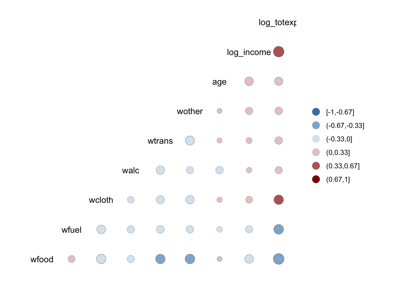
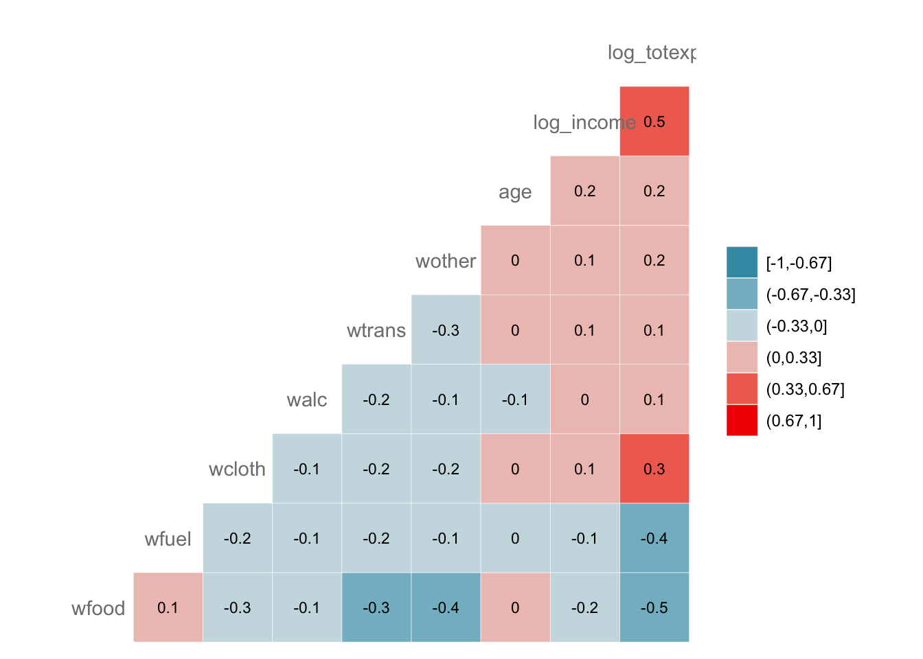
## log_totexp NAVisualize the correlation matrix (heat map)
GGally extends ggplot2 and provides
ggcorr() for correlation heatmaps.
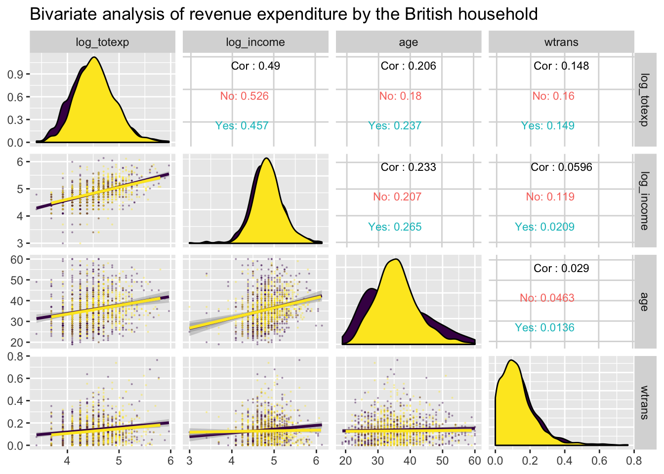
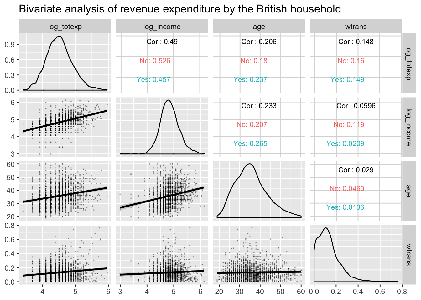
ggpairs: multivariate bivariate plots
GGally::ggpairs() creates a matrix of plots
(distributions on the diagonal, bivariate plots below, and optional
correlations above).
library(ggplot2)

GGally::ggpairs(
  data,
  columns = c("log_totexp", "log_income", "age", "wtrans"),
  title = "Bivariate analysis of expenditure and income (British households)",
  upper = list(continuous = wrap("cor", size = 3)),
  lower = list(continuous = wrap("smooth", alpha = 0.3, linewidth = 0.3)),
  mapping = aes(color = children_fac)
)
Summary
| Library | Objective | Function | Example |
|---|---|---|---|
| stats | Bivariate correlation | cor() | cor(x, y, method = ‘pearson’) |
| stats | Correlation matrix | cor() | cor(df_num, use = ‘pairwise.complete.obs’) |
| Hmisc | P-values for correlation matrix | rcorr() | Hmisc::rcorr(as.matrix(df_num)) |
| GGally | Correlation heat map | ggcorr() | GGally::ggcorr(df_num) |
| GGally | Pairs plot matrix | ggpairs() | GGally::ggpairs(df, columns = …, mapping = aes(color = g)) |
A work by Gianluca Sottile
gianluca.sottile@unipa.it