How to Make a Boxplot in R (with Example)
geom_boxplot() from ggplot2 creates a
box plot. A box plot visualizes the distribution of a numeric variable
using quartiles and helps detect potential outliers.
We will use the airquality dataset (New York air quality
measurements from May to September 1973). We will focus on:
Ozone(numeric)Wind(numeric)Month(May to September; we will treat it as a factor)
Create a box plot
Before plotting, we will:
- Start from
airquality - Drop variables we won’t use
- Convert
Monthto an ordered factor with labels - Create a new categorical variable for the day of the month: Begin / Middle / End
- Remove missing values
library(dplyr)
library(ggplot2)

data_air <- airquality |>
  select(-Solar.R, -Temp) |>
  mutate(
    Month = factor(
      Month,
      ordered = TRUE,
      labels = c("May", "June", "July", "August", "September")
    ),
    day_cat = case_when(
      Day < 10 ~ "Begin",
      Day < 20 ~ "Middle",
      TRUE ~ "End"
    ) |>
      factor(levels = c("Begin", "Middle", "End"))
  )

glimpse(data_air)
## Rows: 153
## Columns: 5
## $ Ozone <int> 41, 36, 12, 18, NA, 28, 23, 19, 8, NA, 7, 16, 11, 14, 18, 14, …
## $ Wind <dbl> 7.4, 8.0, 12.6, 11.5, 14.3, 14.9, 8.6, 13.8, 20.1, 8.6, 6.9, 9…
## $ Month <ord> May, May, May, May, May, May, May, May, May, May, May, May, Ma…
## $ Day <int> 1, 2, 3, 4, 5, 6, 7, 8, 9, 10, 11, 12, 13, 14, 15, 16, 17, 18,…
## $ day_cat <fct> Begin, Begin, Begin, Begin, Begin, Begin, Begin, Begin, Begin,…Basic box plot
Let’s plot the distribution of ozone by month.
box_plot <- ggplot(data_air_nona, aes(x = Month, y = Ozone))

box_plot +
  geom_boxplot() +
  theme_classic()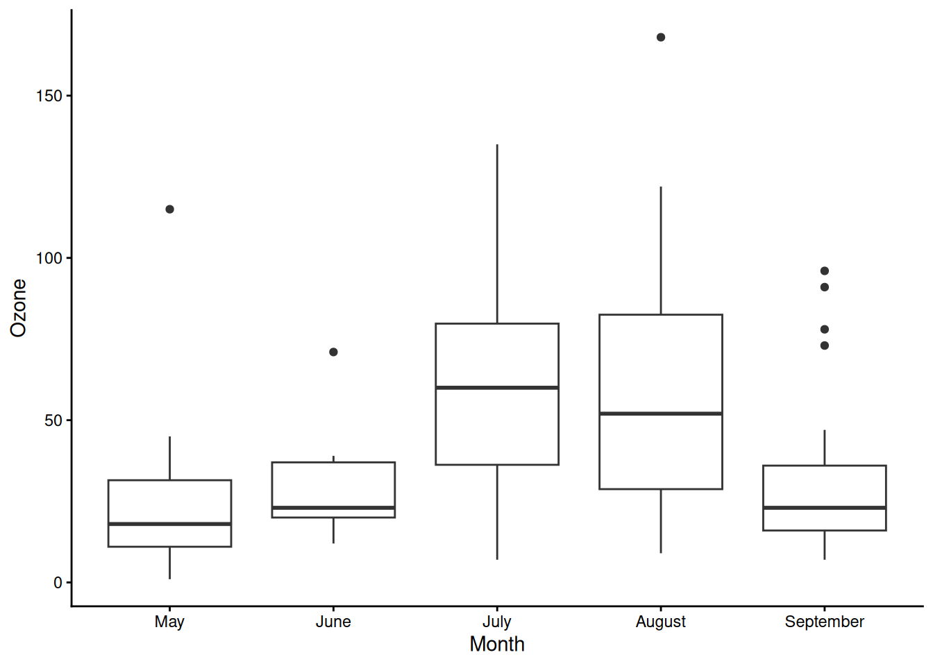
Customize outliers
You can change the outlier appearance (color, shape, and size).
box_plot +
  geom_boxplot(
    outlier.colour = "red",
    outlier.shape = 2,
    outlier.size = 2.8
  ) +
  theme_classic()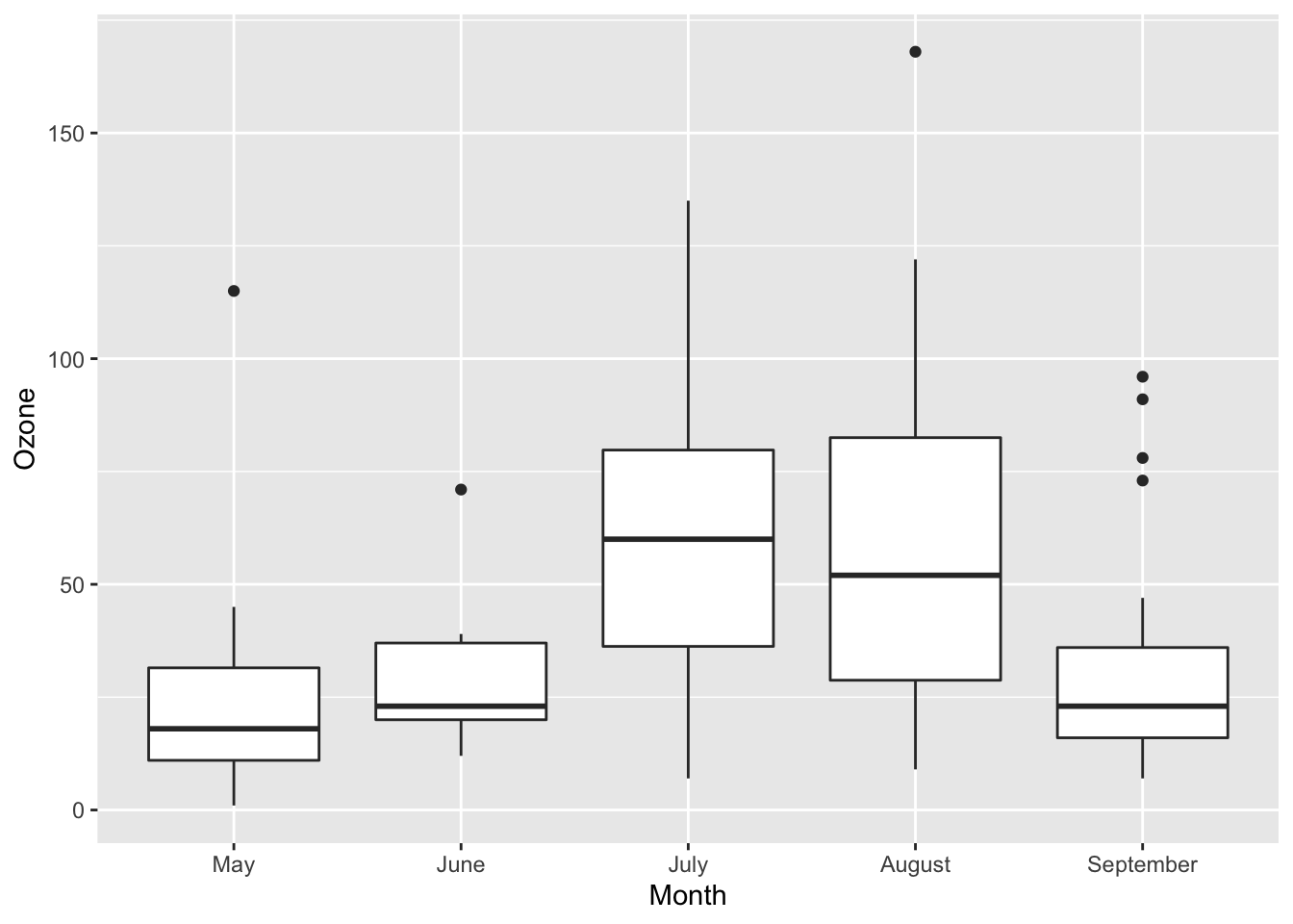
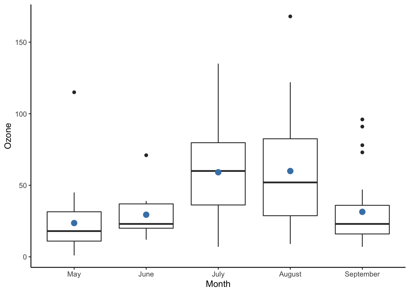
Add a summary statistic (mean)
You can add the mean as an overlay point. Note: in recent ggplot2
versions, use fun = (the old fun.y is
deprecated).
box_plot +
  geom_boxplot() +
  stat_summary(
    fun = mean,
    geom = "point",
    size = 3,
    color = "steelblue"
  ) +
  theme_classic()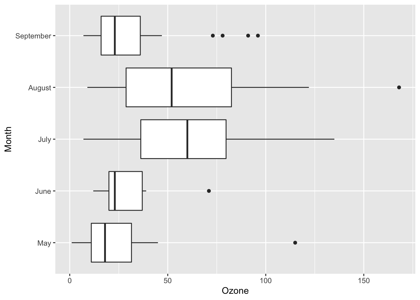
Box plot with dots
A dot layer helps show individual observations.
box_plot +
  geom_boxplot() +
  geom_dotplot(
    binaxis = "y",
    stackdir = "center",
    dotsize = 0.8
  ) +
  theme_classic()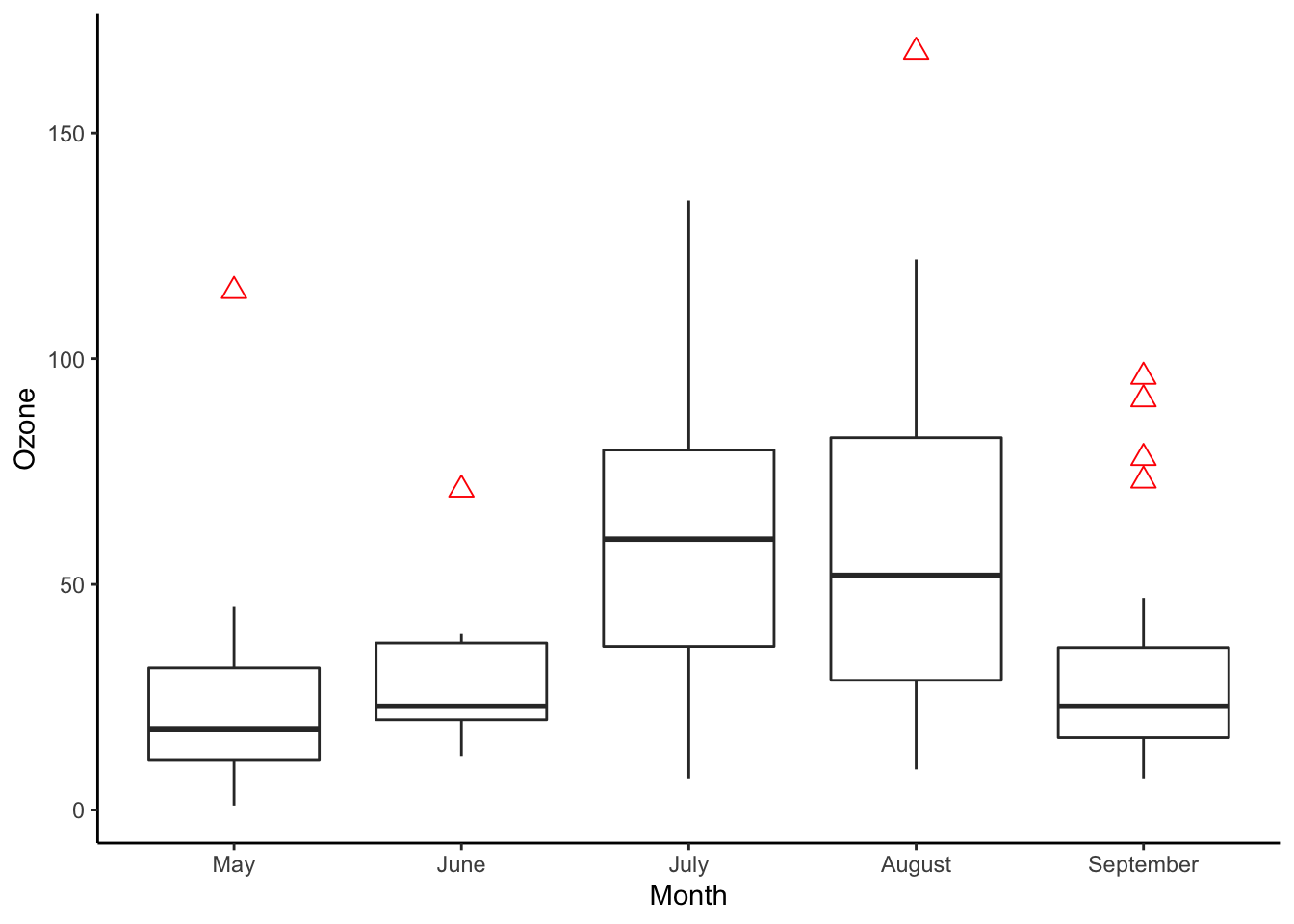
Control aesthetics
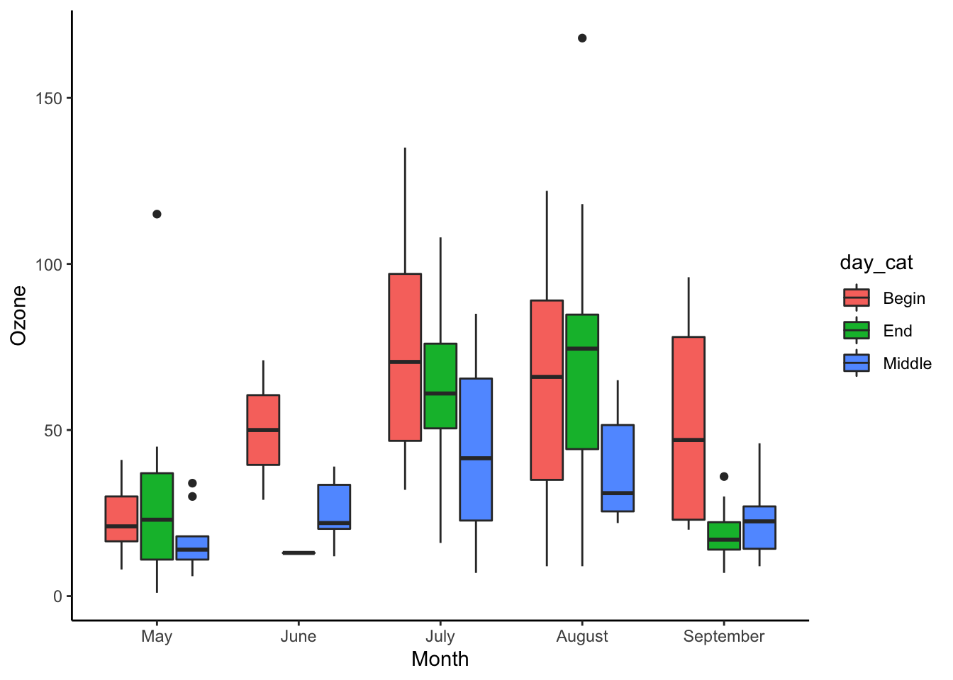
Box plot with multiple groups
Here we compare ozone by month, further split by
day_cat.
ggplot(data_air_nona, aes(x = Month, y = Ozone, fill = day_cat)) +
  geom_boxplot() +
  theme_classic() +
  labs(fill = "Day in month")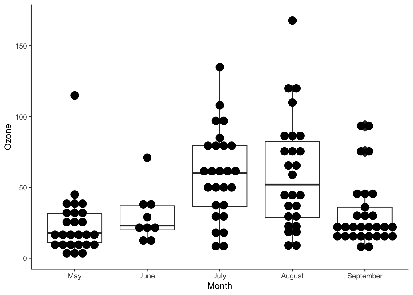
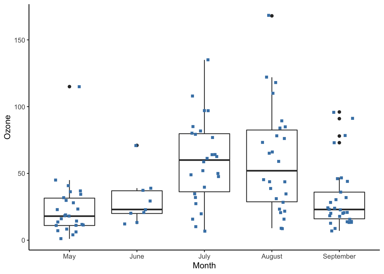
Box plot with jittered points
Jittered points are another common way to display observations and reduce overlap.
box_plot +
  geom_boxplot() +
  geom_jitter(
    width = 0.18,
    shape = 15,
    color = "steelblue",
    alpha = 0.7
  ) +
  theme_classic()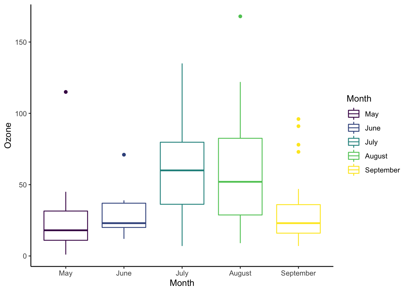
For comparison, here is the same plot using geom_point()
without jitter:
Notched box plot
A notched box plot narrows the box around the median. Non-overlapping notches provide visual evidence that medians may differ.
\[ \text{median} \pm 1.57 \times \frac{\text{IQR}}{\sqrt{n}} \]
Summary
| Objective | Code |
|---|---|
| Basic box plot | ggplot(df, aes(x, y)) + geom_boxplot() |
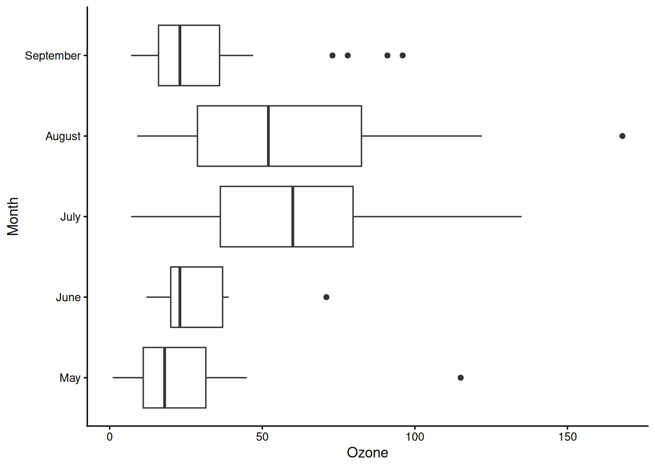
| Flip orientation | ggplot(df, aes(x, y)) + geom_boxplot() + coord_flip() |
| Notched box plot | ggplot(df, aes(x, y)) + geom_boxplot(notch = TRUE) |
| Box plot with jitter | ggplot(df, aes(x, y)) + geom_boxplot() + geom_jitter(width = 0.18) |
A work by Gianluca Sottile
gianluca.sottile@unipa.it