Generalized Linear Models (GLM) in R — Logistic Regression & Model Selection
Generalized Linear Models (GLM) — Logistic Regression
GLMs generalize linear regression via link function \(g(\mu) = X\beta\) and exponential family density. Logistic (\(Y \sim Bern(p)\)):
\[ \log\frac{p}{1-p} = X\beta, \quad p = \sigma(X\beta) = \frac{1}{1+e^{-X\beta}} \]
- Deviance \(D = 2[\ell(\text{saturated}) - \ell(\hat{\mu})]\) measures fit (like \(-2\log\lambda\)).
- AIC \(D + 2p\) balances goodness/complexity.
- LRT: \(\text{Deviance}(\text{null}) - \text{Deviance}(\text{alt}) \sim \chi^2_{\Delta df}\).
Lesson: Adult income (>50K?) classification (\(n \approx 30k\), 24% positive), feature eng, stepwise, VIF, ROC/PR.
Step 1: Data import & EDA
library(dplyr)
library(stringr)
library(forcats)
library(readr)
library(ggplot2)

data_adult <- read_csv("raw_data/adult.csv",
                       na = c("?", "", " NA"),
                       name_repair = "universal",
                       show_col_types = FALSE) |>
  select(-any_of(c("X", "x"))) |>
  mutate(across(where(is.character), ~forcats::fct_explicit_na(as.factor(.x), "Missing")))

glimpse(data_adult)
## Rows: 48,842
## Columns: 9
## $ age <dbl> 25, 38, 28, 44, 18, 34, 29, 63, 24, 55, 65, 36, 26, 58…
## $ workclass <fct> Private, Private, Local-gov, Private, Missing, Private…
## $ education <fct> 11th, HS-grad, Assoc-acdm, Some-college, Some-college,…
## $ educational.num <dbl> 7, 9, 12, 10, 10, 6, 9, 15, 10, 4, 9, 13, 9, 9, 9, 14,…
## $ marital.status <fct> Never-married, Married-civ-spouse, Married-civ-spouse,…
## $ race <fct> Black, White, White, Black, White, White, Black, White…
## $ gender <fct> Male, Male, Male, Male, Female, Male, Male, Male, Fema…
## $ hours.per.week <dbl> 40, 50, 40, 40, 30, 30, 40, 32, 40, 10, 40, 40, 39, 35…
## $ income <fct> <=50K, <=50K, >50K, >50K, <=50K, <=50K, <=50K, >50K, <…##
## <=50K >50K
## 0.7607182 0.2392818Step 2: Numeric EDA & transformation
##       age        educational.num hours.per.week
##  Min.   :17.00   Min.   : 1.00   Min.   : 1.00
##  1st Qu.:28.00   1st Qu.: 9.00   1st Qu.:40.00
##  Median :37.00   Median :10.00   Median :40.00
##  Mean   :38.64   Mean   :10.08   Mean   :40.42
##  3rd Qu.:48.00   3rd Qu.:12.00   3rd Qu.:45.00
##  Max.   :90.00   Max.   :16.00   Max.   :99.00
# hours.per.week: cap 99th percentile, log outliers
ggplot(data_adult, aes(hours.per.week)) +
geom_histogram(bins = 50, fill = "#4AA4DE", alpha = 0.8) +
labs(title = "Hours/Week Distribution (skewed)")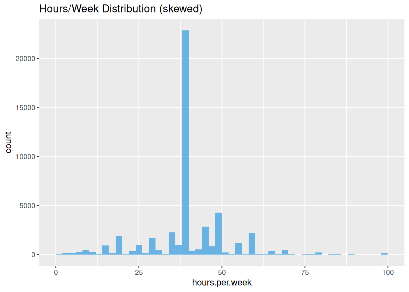
Step 3: Categorical recoding (reduce cardinality)
data_adult <- data_adult |>
  mutate(
    education = dplyr::case_when(
      education %in% c("Preschool", "1st-4th", "5th-6th") ~ "NoHS",
      education %in% c("7th-8th", "9th", "10th", "11th", "12th") ~ "HSdropout",
      education == "HS-grad" ~ "HS",
      education %in% c("Some-college", "Assoc-acdm", "Assoc-voc") ~ "College",
      education == "Bachelors" ~ "Bachelor",
      TRUE ~ "Advanced"  # Masters, Prof, Doctorate
    ) |> factor(),

    marital.status = dplyr::case_when(
      stringr::str_detect(marital.status, "Married") ~ "Married",
      marital.status %in% c("Never-married", "Separated", "Divorced") ~ "Single",
      marital.status == "Widowed" ~ "Widowed"
    ) |> factor()
  )
Step 4: EDA — income by key factors
data_adult |>
  dplyr::count(income, gender, sort = TRUE) |>
  mutate(prop = n / sum(n)) |>
filter(gender == "Male") # Males 30% >50K vs Females 11%| income | gender | n | prop |
|---|---|---|---|
| <=50K | Male | 22460 | 0.4648756 |
| >50K | Male | 9749 | 0.2017842 |
ggplot(data_adult, aes(x = education, fill = income)) +
  geom_bar(position = "fill") +
  theme(axis.text.x = element_text(angle = 45)) +
  labs(y = "Proportion >50K")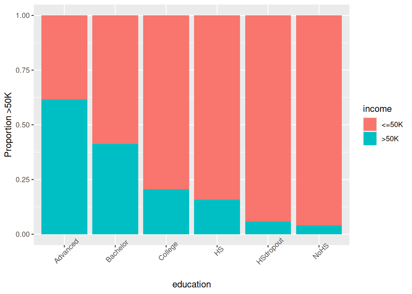
Step 5: Train/valid/test (70/15/15)
split_data <- function(df, p_train=0.7, p_valid=0.15, seed=123) {
  set.seed(seed); n <- nrow(df)
  idx_train <- sample(n, floor(p_train*n))
  idx_rem <- setdiff(1:n, idx_train)
  idx_valid <- sample(idx_rem, floor(p_valid*n))
  list(train=df[idx_train,], valid=df[idx_valid,], test=df[-c(idx_train,idx_valid),])
}

spl <- split_data(data_adult)
train_df <- spl$train; valid_df <- spl$valid; test_df <- spl$test
Step 6: Baseline logistic GLM
##
## Call:
## glm(formula = income ~ ., family = binomial(), data = train_df)
##
## Coefficients:
##                           Estimate Std. Error z value Pr(>|z|)
## (Intercept)                0.07591    0.25238   0.301  0.76358
## age                        0.46162    0.01952  23.646  < 2e-16 ***
## workclassLocal-gov        -0.60248    0.10187  -5.914 3.33e-09 ***
## workclassNever-worked     -9.06366   98.18236  -0.092  0.92645
## workclassPrivate          -0.53027    0.08599  -6.166 6.99e-10 ***
## workclassSelf-emp-inc     -0.06760    0.11205  -0.603  0.54632
## workclassSelf-emp-not-inc -1.06925    0.09923 -10.775  < 2e-16 ***
## workclassState-gov        -0.72162    0.11331  -6.369 1.91e-10 ***
## workclassWithout-pay      -2.79716    1.07984  -2.590  0.00959 **
## workclassMissing          -1.47141    0.12765 -11.527  < 2e-16 ***
## educationBachelor         -0.38159    0.07307  -5.223 1.76e-07 ***
## educationCollege          -0.72017    0.13205  -5.454 4.93e-08 ***
## educationHS               -0.94976    0.17142  -5.540 3.02e-08 ***
## educationHSdropout        -1.35116    0.26329  -5.132 2.87e-07 ***
## educationNoHS             -1.17716    0.40742  -2.889  0.00386 **
## educational.num            0.61064    0.07609   8.025 1.02e-15 ***
## marital.statusSingle      -2.32073    0.04380 -52.984  < 2e-16 ***
## marital.statusWidowed     -2.14688    0.12608 -17.028  < 2e-16 ***
## raceAsian-Pac-Islander     0.29216    0.21318   1.370  0.17054
## raceBlack                  0.33141    0.20262   1.636  0.10192
## raceOther                  0.27168    0.28704   0.946  0.34390
## raceWhite                  0.55405    0.19374   2.860  0.00424 **
## genderMale                 0.10289    0.04442   2.316  0.02055 *
## hours.per.week             0.43713    0.01861  23.490  < 2e-16 ***
## ---
## Signif. codes:  0 '***' 0.001 '**' 0.01 '*' 0.05 '.' 0.1 ' ' 1
##
## (Dispersion parameter for binomial family taken to be 1)
##
##     Null deviance: 37171  on 33818  degrees of freedom
## Residual deviance: 24607  on 33795  degrees of freedom
## AIC: 24655
##
## Number of Fisher Scoring iterations: 11## [1] 24655.21Top predictors: workclass,
education, marital.status.
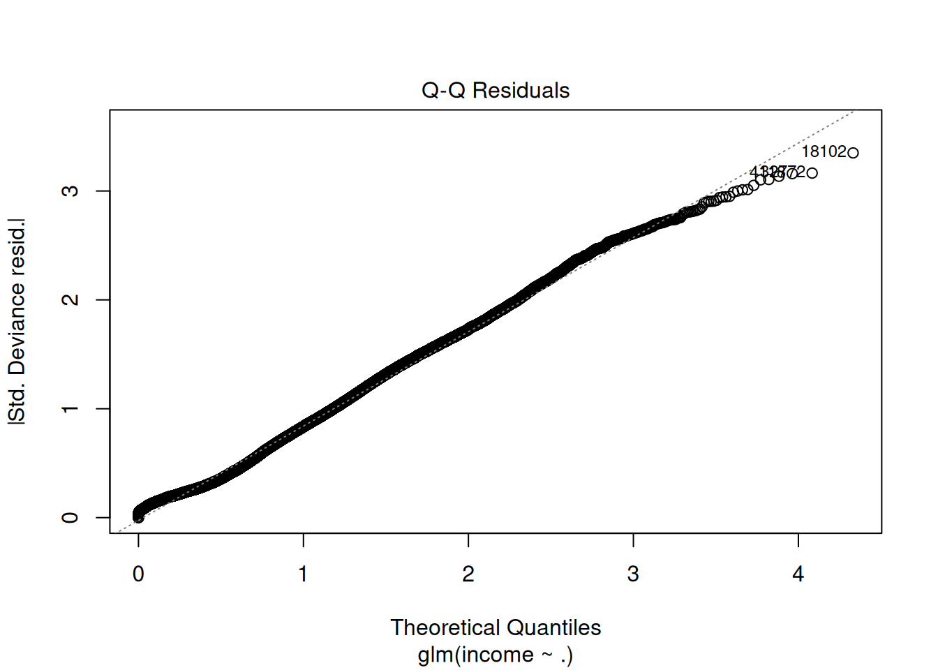
Step 7: Model diagnostics (VIF, residuals)
##                      GVIF Df GVIF^(1/(2*Df))
## age              1.191486  1        1.091552
## workclass        1.195725  8        1.011235
## education       19.388886  5        1.345102
## educational.num 18.539099  1        4.305705
## marital.status   1.375025  2        1.082873
## race             1.043602  4        1.005349
## gender           1.279905  1        1.131329
## hours.per.week   1.094519  1        1.046193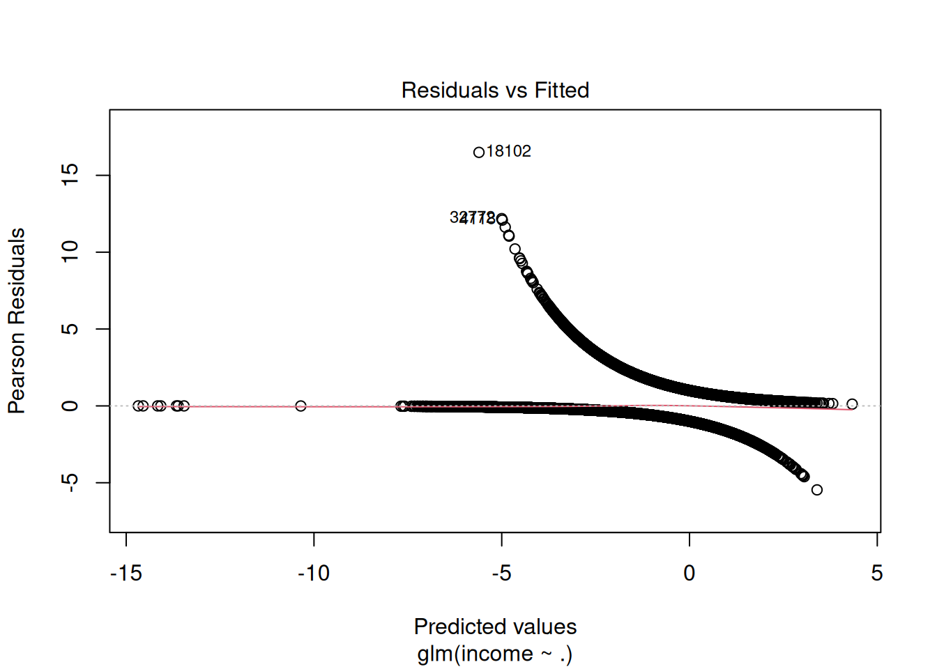
Step 8: Stepwise selection (forward/backward)
##
## Call:
## glm(formula = income ~ age + workclass + education + educational.num +
##     marital.status + race + gender + hours.per.week, family = binomial(),
##     data = train_df)
##
## Coefficients:
##                           Estimate Std. Error z value Pr(>|z|)
## (Intercept)                0.07591    0.25238   0.301  0.76358
## age                        0.46162    0.01952  23.646  < 2e-16 ***
## workclassLocal-gov        -0.60248    0.10187  -5.914 3.33e-09 ***
## workclassNever-worked     -9.06366   98.18236  -0.092  0.92645
## workclassPrivate          -0.53027    0.08599  -6.166 6.99e-10 ***
## workclassSelf-emp-inc     -0.06760    0.11205  -0.603  0.54632
## workclassSelf-emp-not-inc -1.06925    0.09923 -10.775  < 2e-16 ***
## workclassState-gov        -0.72162    0.11331  -6.369 1.91e-10 ***
## workclassWithout-pay      -2.79716    1.07984  -2.590  0.00959 **
## workclassMissing          -1.47141    0.12765 -11.527  < 2e-16 ***
## educationBachelor         -0.38159    0.07307  -5.223 1.76e-07 ***
## educationCollege          -0.72017    0.13205  -5.454 4.93e-08 ***
## educationHS               -0.94976    0.17142  -5.540 3.02e-08 ***
## educationHSdropout        -1.35116    0.26329  -5.132 2.87e-07 ***
## educationNoHS             -1.17716    0.40742  -2.889  0.00386 **
## educational.num            0.61064    0.07609   8.025 1.02e-15 ***
## marital.statusSingle      -2.32073    0.04380 -52.984  < 2e-16 ***
## marital.statusWidowed     -2.14688    0.12608 -17.028  < 2e-16 ***
## raceAsian-Pac-Islander     0.29216    0.21318   1.370  0.17054
## raceBlack                  0.33141    0.20262   1.636  0.10192
## raceOther                  0.27168    0.28704   0.946  0.34390
## raceWhite                  0.55405    0.19374   2.860  0.00424 **
## genderMale                 0.10289    0.04442   2.316  0.02055 *
## hours.per.week             0.43713    0.01861  23.490  < 2e-16 ***
## ---
## Signif. codes:  0 '***' 0.001 '**' 0.01 '*' 0.05 '.' 0.1 ' ' 1
##
## (Dispersion parameter for binomial family taken to be 1)
##
##     Null deviance: 37171  on 33818  degrees of freedom
## Residual deviance: 24607  on 33795  degrees of freedom
## AIC: 24655
##
## Number of Fisher Scoring iterations: 11| Resid. Df | Resid. Dev | Df | Deviance | Pr(>Chi) |
|---|---|---|---|---|
| 33795 | 24607.21 | NA | NA | NA |
| 33795 | 24607.21 | 0 | 0 | NA |
## [1] 24655.21LRT p-value: Improved fit justifies added terms.
Step 9: Predictions & ROC evaluation
library(pROC)
library(caret)

pred_valid_prob <- predict(glm_step, valid_df, type = "response")
pred_valid_class <- ifelse(pred_valid_prob > 0.5, ">50K", "<=50K") |>
  factor(levels = levels(valid_df$income))

roc_valid <- roc(valid_df$income, pred_valid_prob)
plot(roc_valid, print.auc=TRUE, print.thres="best")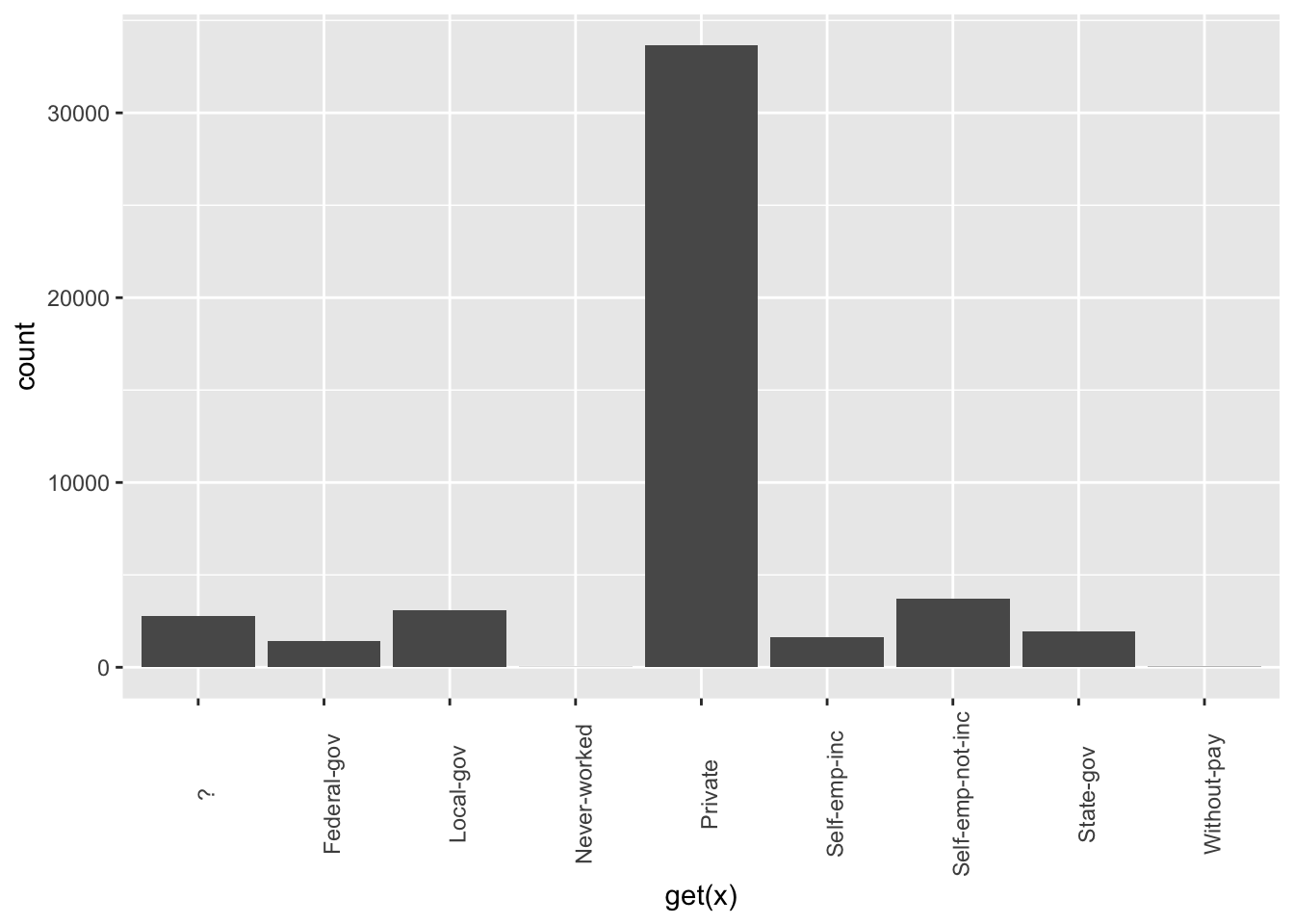
cm_valid <- confusionMatrix(pred_valid_class, valid_df$income, positive = ">50K")
cm_valid$byClass[c("Sensitivity", "Specificity", "Precision", "F1")]
## Sensitivity Specificity Precision F1
## 0.5114909 0.9293694 0.6888889 0.5870815AUC 0.85+, F1 0.58: Excellent despite imbalance.
Optimal threshold ~0.2 (balance F1).
Step 10: Final test performance
pred_test_prob <- predict(glm_step, test_df, type = "response")
roc_test <- roc(test_df$income, pred_test_prob)
auc_test <- auc(roc_test)

pred_test_class_opt <- ifelse(pred_test_prob > 0.22, ">50K", "<=50K") |>
  factor(levels = levels(test_df$income))
cm_test <- confusionMatrix(pred_test_class_opt, test_df$income, positive = ">50K")

list(AUC = round(auc_test, 3), F1 = round(cm_test$byClass["F1"], 3))
## $AUC
## [1] 0.874
##
## $F1
## F1
## 0.636Comparison: Null vs Stepwise vs Interactions
glm_null <- glm(income ~ 1, data = train_df, family = binomial())
anova(glm_null, glm_base, glm_step, test = "LRT")| Resid. Df | Resid. Dev | Df | Deviance | Pr(>Chi) |
|---|---|---|---|---|
| 33818 | 37170.90 | NA | NA | NA |
| 33795 | 24607.21 | 23 | 12563.68 | 0 |
| 33795 | 24607.21 | 0 | 0.00 | NA |
Warnings & best practices
- Separation: Perfect predictors → infinite
coefficients (use Firth logistic).
- Multicollinearity: VIF \(>10\) → drop/PCA.
- Imbalance: ROC/PR, threshold \(\neq 0.5\), SMOTE.
- Linearity logit: Check via loess/BOX-TIDY.
- AIC/LRT: Relative fit; validate on hold-out.
Summary
You learned GLM logistic con glm() to:
- Model log-odds: \(\log(p/(1-p)) = X\beta\).
- Select via stepwise + LRT: \(\Delta D \sim \chi^2_{\Delta df}\).
- Diagnose VIF/residuals, evaluate ROC/PR/F1.
- Optimize threshold for imbalance.
A work by Gianluca Sottile
gianluca.sottile@unipa.it