Bar Chart & Histogram in R (with Example)
A bar chart is a great way to display a categorical variable on the x-axis. The y-axis can represent:
- A count of observations in each group.
- A summary value (e.g., mean, median, min/max) computed for each group.
In this lesson we use the mtcars dataset and focus
on:
cyl: number of cylinders (numeric, but used as a category)am: transmission (0 = automatic, 1 = manual)mpg: miles per gallon (numeric)
How to create a bar chart
With ggplot2, the general pattern is:
In this tutorial we will mainly use:
geom_bar()for counts (default behavior:stat = "count")geom_col()for precomputed values (equivalent togeom_bar(stat = "identity"))
Bar chart (counts)
Basic count bar chart
library(ggplot2)

ggplot(mtcars, aes(x = factor(cyl))) +
  geom_bar() +
  theme_classic() +
  labs(x = "Cylinders", y = "Count")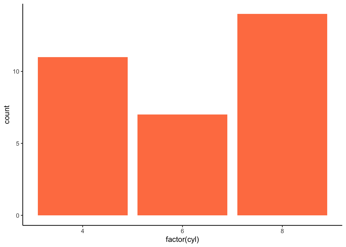
Change the bar color
ggplot(mtcars, aes(x = factor(cyl))) +
  geom_bar(fill = "coral") +
  theme_classic() +
  labs(x = "Cylinders", y = "Count")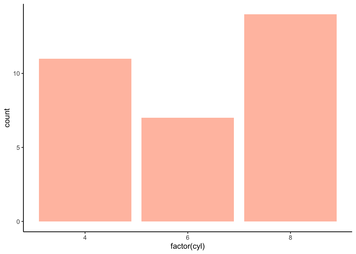
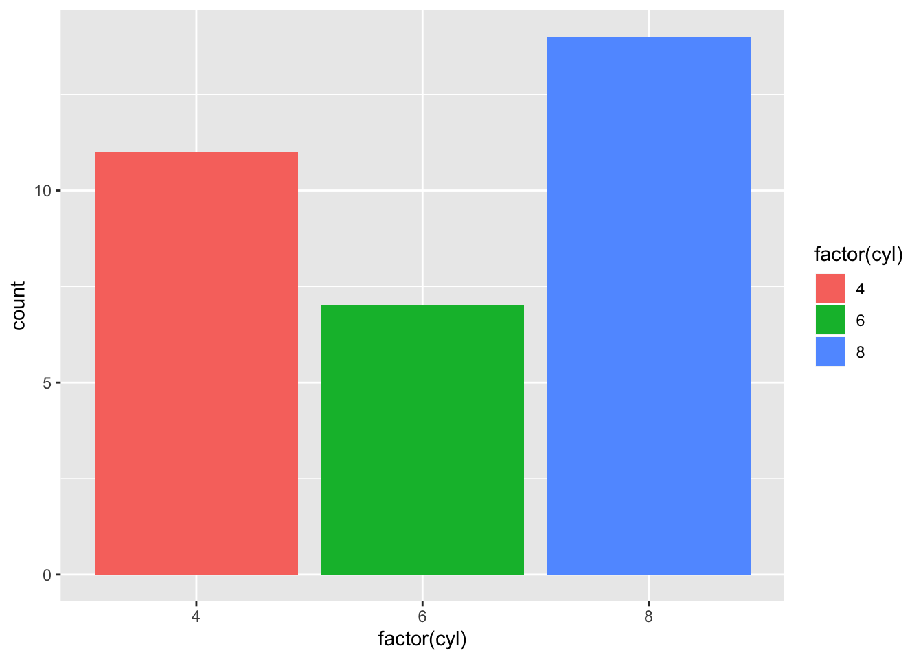
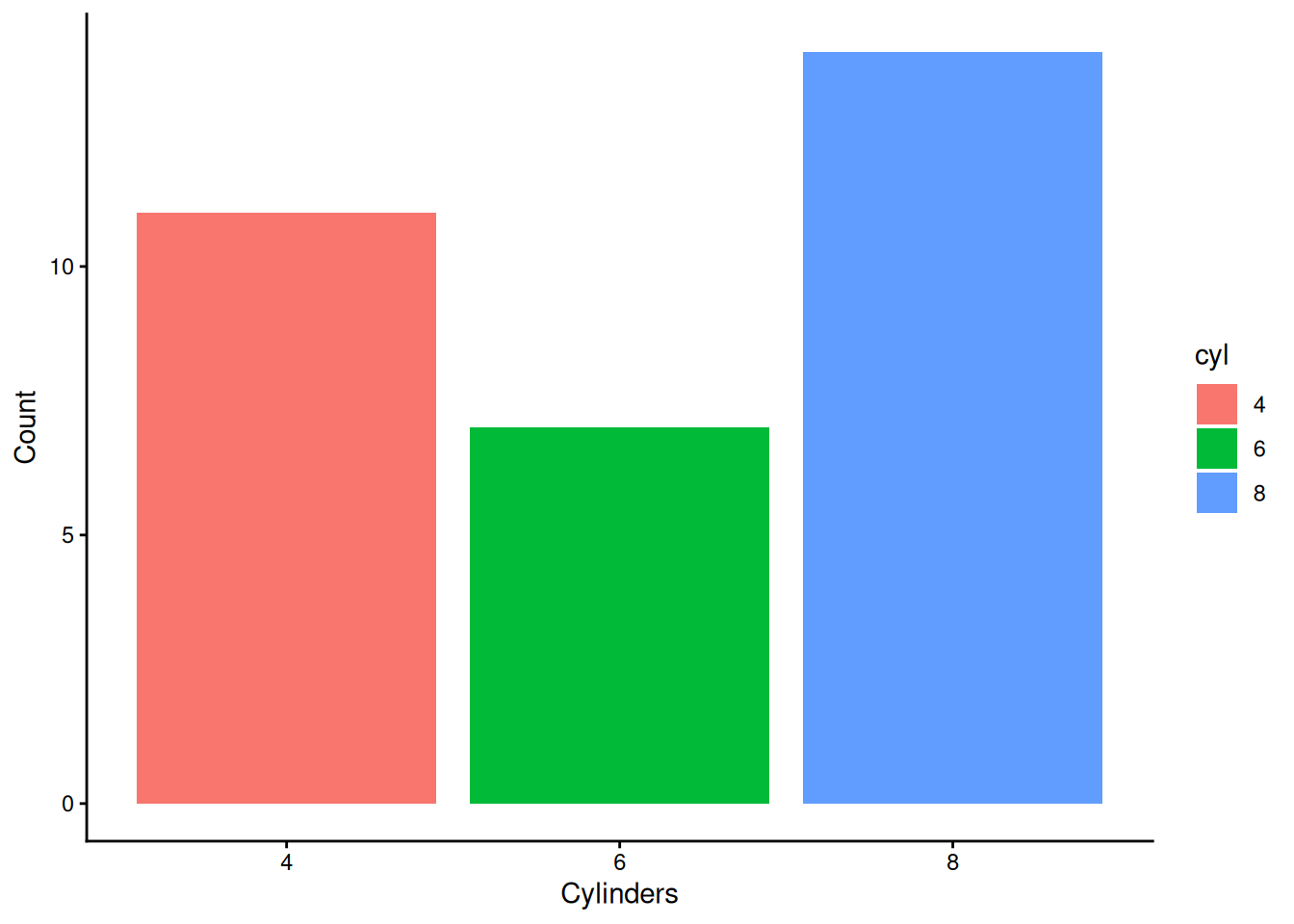
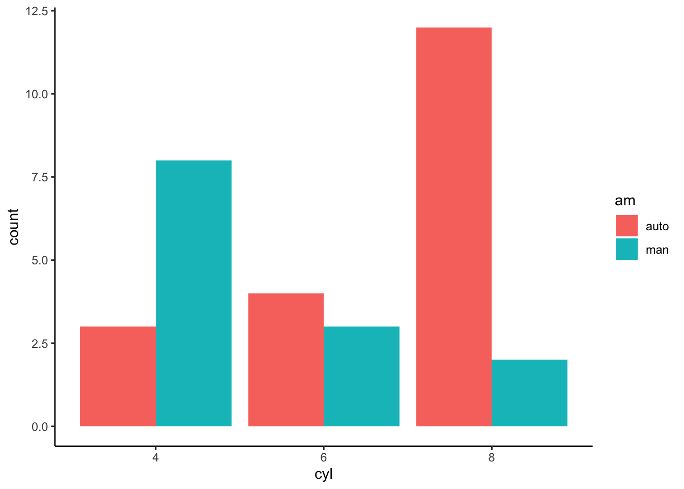
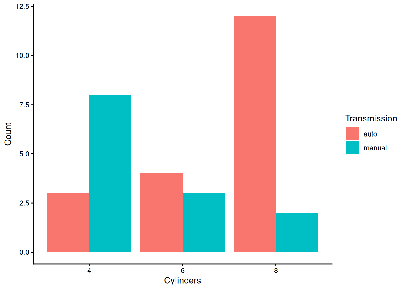
Grouped bar charts
A common use case is to show counts of a second categorical variable within each bar.
Prepare the dataset
Stacked bars (default)
ggplot(cars, aes(x = cyl, fill = am)) +
  geom_bar() +
  theme_classic() +
  labs(x = "Cylinders", y = "Count", fill = "Transmission")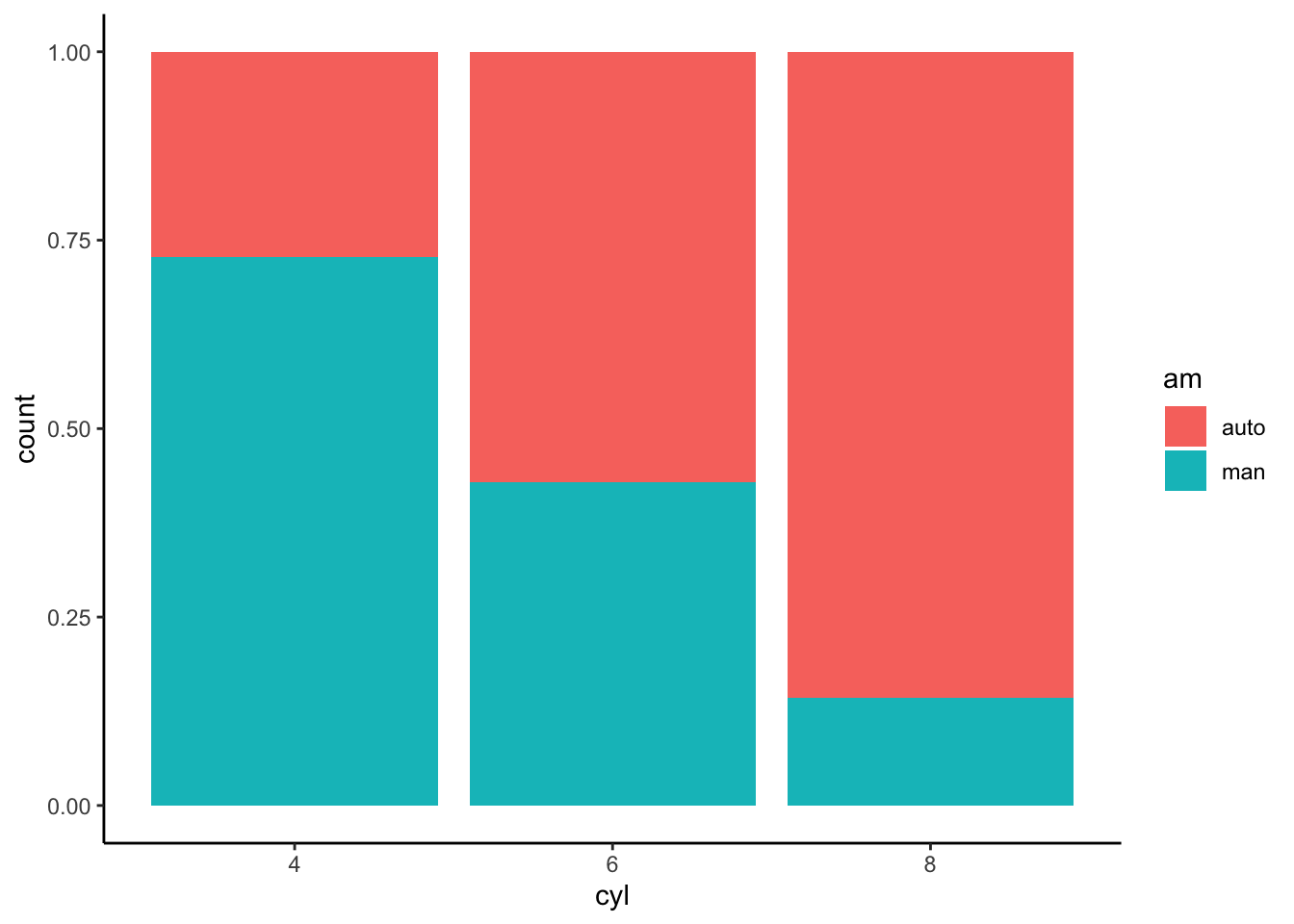
Bar chart (values)
Sometimes you want bars to represent a numeric value (e.g., mean
mpg) rather than counts. In this case, compute the summary
first and then use geom_col().
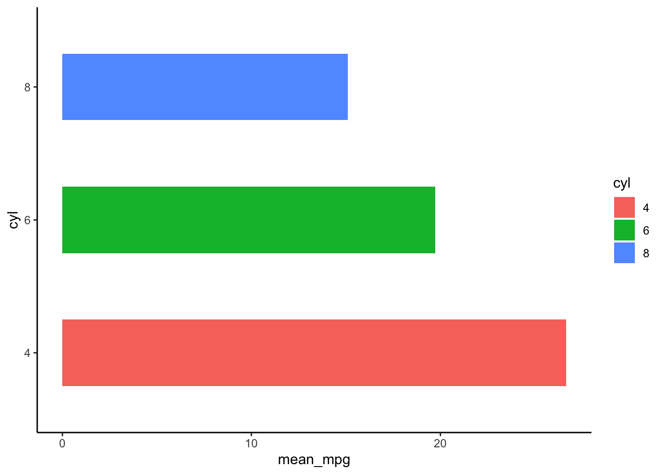
Step 1) Compute mean mpg by cylinders
data_bar <- cars |>
  group_by(cyl) |>
  summarise(mean_mpg = mean(mpg), .groups = "drop") |>
  mutate(mean_mpg = round(mean_mpg, 2))

data_bar| cyl | mean_mpg |
|---|---|
| 4 | 26.66 |
| 6 | 19.74 |
| 8 | 15.10 |
Step 2) Plot the bars
ggplot(data_bar, aes(x = cyl, y = mean_mpg)) +
  geom_col() +
  theme_classic() +
  labs(x = "Cylinders", y = "Mean mpg")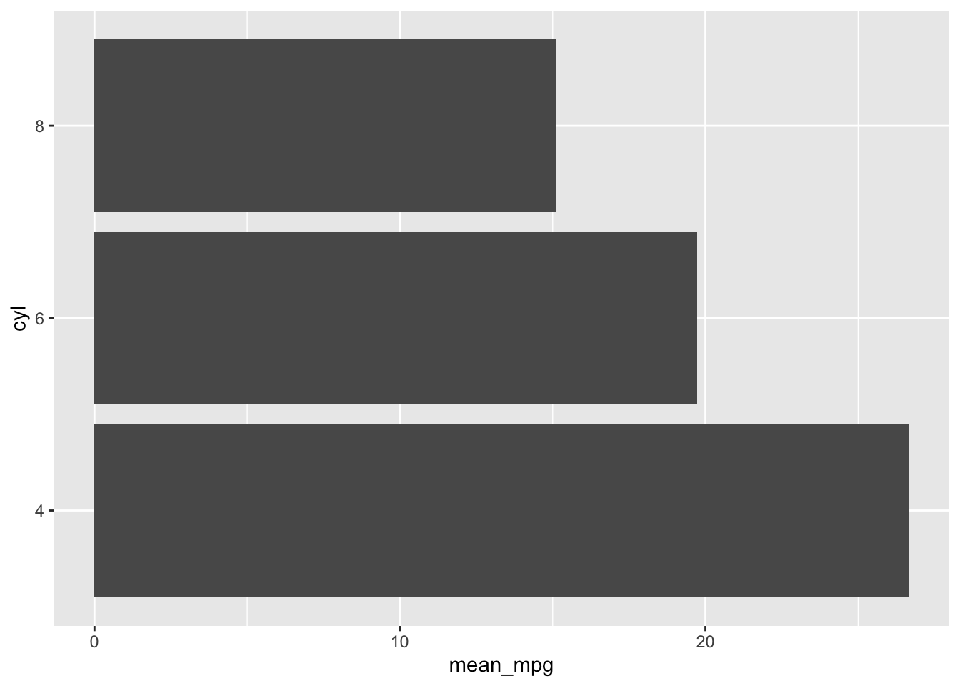
Step 3) Horizontal bars
ggplot(data_bar, aes(x = cyl, y = mean_mpg)) +
  geom_col() +
  coord_flip() +
  theme_classic() +
  labs(x = "Cylinders", y = "Mean mpg")

Histogram
A histogram is used for continuous variables and
shows the distribution of values by binning. For example, here is the
distribution of mpg:
ggplot(mtcars, aes(x = mpg)) +
  geom_histogram(bins = 12, fill = "#4AA4DE", color = "white") +
  theme_classic() +
  labs(x = "mpg", y = "Count")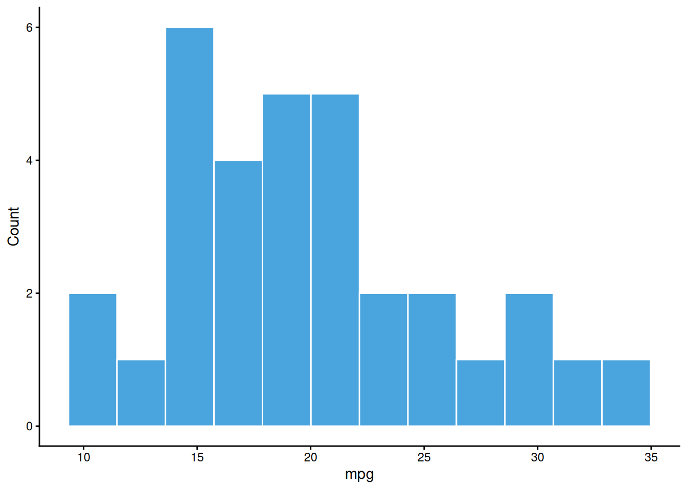
Summary
| Objective | Example |
|---|---|
| Count bars | ggplot(df, aes(x)) + geom_bar() |
| Count bars (grouped, stacked) | ggplot(df, aes(x, fill = g)) + geom_bar() |
| Count bars (grouped, side-by-side) | ggplot(df, aes(x, fill = g)) + geom_bar(position = position_dodge()) |
| Percent stacked bars | ggplot(df, aes(x, fill = g)) + geom_bar(position = ‘fill’) |
| Bars representing values (precomputed y) | ggplot(df_sum, aes(x, y)) + geom_col() |
A work by Gianluca Sottile
gianluca.sottile@unipa.it