K-means Clustering in R — Lloyd’s Algorithm & Cluster Validation
K-means Clustering — Lloyd’s Algorithm
K-means partitions \(n\) observations into \(k\) clusters by minimizing the within-cluster sum of squares (SSE):
\[ \text{WCSS}(k) = \sum_{r=1}^k \sum_{i \in C_r} \lVert x_i - \bar{x}_r \rVert^2 \]
Lloyd’s algorithm proceeds as follows:
- Initialize \(k\) centroids \(\mu_1^{(0)}, \dots, \mu_k^{(0)}\).
- Assign each point \(x_i\) to the closest centroid (typically Euclidean distance): \[ r^{(t)}(i) = \arg\min_r \lVert x_i - \mu_r^{(t-1)} \rVert_2. \]
- Update each centroid as the mean of its assigned points: \[ \mu_r^{(t)} = \frac{1}{|C_r^{(t)}|} \sum_{i \in C_r^{(t)}} x_i. \]
- Repeat steps 2–3 until convergence (no changes in assignments or a maximum number of iterations reached).
The optimization problem is non-convex, so the solution depends on
initialization. It is therefore standard practice to use
multiple random starts (large nstart) to
reduce the risk of converging to poor local optima. The method
implicitly assumes clusters that are approximately
spherical and with comparable variance.
In this lesson we use a personal computer price/specifications dataset, choose the number of clusters \(k\) using elbow, silhouette, and gap statistic, and then assess stability and interpret the resulting clusters.
Step 1: Data preparation and standardization
library(dplyr)
library(readr)

df_raw <- read_csv("raw_data/computers.csv", show_col_types = FALSE) |>
  select(-...1, -cd, -multi, -premium) |>  # keep only useful numeric variables
  na.omit()

glimpse(df_raw)
## Rows: 6,259
## Columns: 7
## $ price <dbl> 1499, 1795, 1595, 1849, 3295, 3695, 1720, 1995, 2225, 2575, 219…
## $ speed <dbl> 25, 33, 25, 25, 33, 66, 25, 50, 50, 50, 33, 66, 50, 25, 50, 50,…
## $ hd <dbl> 80, 85, 170, 170, 340, 340, 170, 85, 210, 210, 170, 210, 130, 2…
## $ ram <dbl> 4, 2, 4, 8, 16, 16, 4, 2, 8, 4, 8, 8, 4, 8, 8, 4, 2, 4, 4, 8, 4…
## $ screen <dbl> 14, 14, 15, 14, 14, 14, 14, 14, 14, 15, 15, 14, 14, 14, 14, 14,…
## $ ads <dbl> 94, 94, 94, 94, 94, 94, 94, 94, 94, 94, 94, 94, 94, 94, 94, 94,…
## $ trend <dbl> 1, 1, 1, 1, 1, 1, 1, 1, 1, 1, 1, 1, 1, 1, 1, 1, 1, 1, 1, 1, 1, …# Standardization is critical for distance-based methods
pc_scaled <- df_raw |>
mutate(across(where(is.numeric), scale)) |>
as.data.frame()
summary(pc_scaled[, 1:3])## price.V1 speed.V1
## Min. :-2.187617004530 Min. :-1.27665005893e+00
## 1st Qu.:-0.732737106110 1st Qu.:-8.98537758411e-01
## Median :-0.130124130434 Median :-9.50491198009e-02
## Mean : 0.000000000000 Mean : 1.00000000000e-16
## 3rd Qu.: 0.646385732508 3rd Qu.: 6.61175481243e-01
## Max. : 5.474176543350 Max. : 2.26815275846e+00
## hd.V1
## Min. :-1.301890225390
## 1st Qu.:-0.783612113488
## Median :-0.296275978415
## Mean : 0.000000000000
## 3rd Qu.: 0.430860477092
## Max. : 6.510958924200Step 2: Elbow method (WCSS vs k)
library(ggplot2)

kmeans_wss <- function(k, data, seed = 123, nstart = 50) {
  set.seed(seed)
  kmeans(data, centers = k, nstart = nstart)$tot.withinss
}

k_range <- 1:15
wss_df <- data.frame(
  k   = k_range,
  wss = sapply(k_range, kmeans_wss, data = pc_scaled)
)

ggplot(wss_df, aes(x = k, y = wss)) +
  geom_point(size = 3, color = "steelblue") +
  geom_line(color = "steelblue", size = 1) +
  geom_vline(xintercept = 6, linetype = "dashed", color = "red") +
  labs(
    title    = "Elbow Method — Computer Clusters",
    subtitle = "k = 6 suggested (diminishing returns in WCSS)",
    x        = "Number of clusters (k)",
    y        = "Total Within-Cluster SSE"
  ) +
  theme_minimal()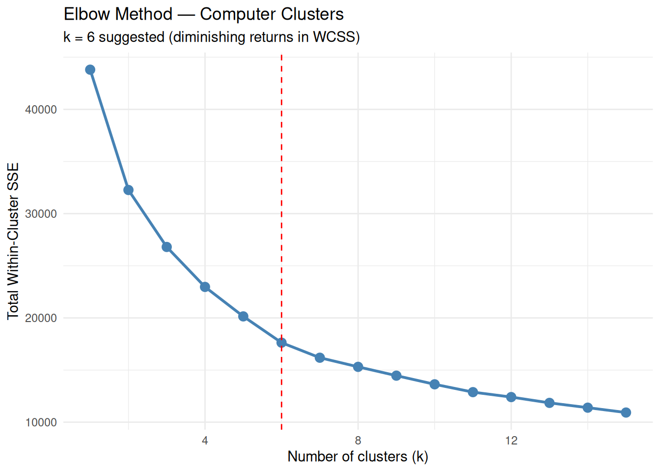
The “elbow” around \(k = 6\) indicates a reasonable compromise between cluster compactness and model complexity.
Step 3: Silhouette analysis (cohesion and separation)
Silhouette width measures, for each observation, how similar it is to its own cluster compared to the nearest alternative cluster. High average silhouette values indicate well-separated clusters.
library(cluster)

sil_widths <- function(k, data, seed = 123, nstart = 50) {
  if (k == 1) return(NA_real_)
  set.seed(seed)
  kcl <- kmeans(data, centers = k, nstart = nstart)
  ss <- silhouette(kcl$cluster, dist(data))
  mean(ss[, 3])
}

sil_df <- data.frame(
  k          = k_range,
  silhouette = sapply(k_range, sil_widths, data = pc_scaled)
)

ggplot(sil_df, aes(x = k, y = silhouette)) +
  geom_point(size = 3, color = "darkgreen") +
  geom_line(color = "darkgreen", size = 1) +
  geom_vline(xintercept = which.max(sil_df$silhouette),
             linetype = "dashed", color = "red") +
  labs(
    title    = "Average Silhouette Width",
    subtitle = paste("Optimal k =", which.max(sil_df$silhouette)),
    x        = "Number of clusters (k)",
    y        = "Average Silhouette Width"
  ) +
  theme_minimal()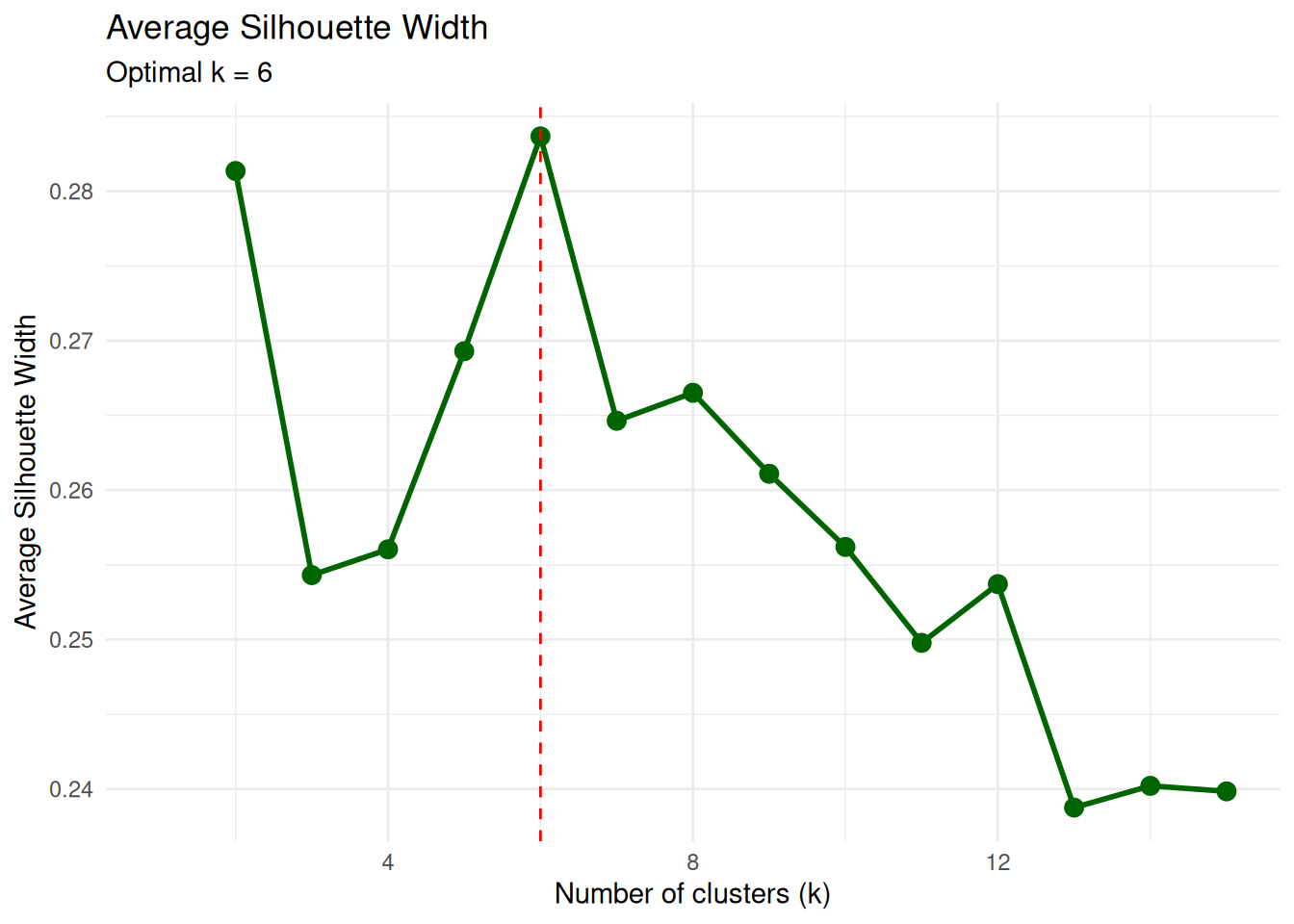
The maximum average silhouette at \(k\) close to 6 is consistent with the elbow method.
Step 4: Final k-means model with k = 6
set.seed(123)
k_final <- 6

pc_k6 <- kmeans(pc_scaled, centers = k_final, nstart = 50)

pc_k6$size          # cluster sizes
## [1] 612 2150 542 623 1014 1318## [1] 17624.92Cluster sizes are useful to check that no group is trivially small or degenerate (e.g., isolated singletons) unless such structure is expected.
Step 5: Cluster visualization (PCA projection)
To visualize the clusters in two dimensions, we perform a PCA on the standardized data and color each point by its cluster assignment.
## Importance of components:
##                           PC1    PC2    PC3    PC4    PC5     PC6    PC7
## Standard deviation     1.6915 1.2018 0.9516 0.8801 0.8516 0.40097 0.3579
## Proportion of Variance 0.4088 0.2064 0.1294 0.1106 0.1036 0.02297 0.0183
## Cumulative Proportion  0.4088 0.6151 0.7445 0.8551 0.9587 0.98170 1.0000
pc_df <- data.frame(
pc1 = pc_obj$x[, 1],
pc2 = pc_obj$x[, 2],
cluster = factor(pc_k6$cluster)
)
ggplot(pc_df, aes(x = pc1, y = pc2, color = cluster, shape = cluster)) +
geom_point(size = 2.5, alpha = 0.8) +
labs(
title = "K-means Clusters (PCA projection)",
subtitle = "k = 6 | PC1 + PC2 ≈ 62% of variance",
x = "PC1",
y = "PC2"
) +
theme_minimal()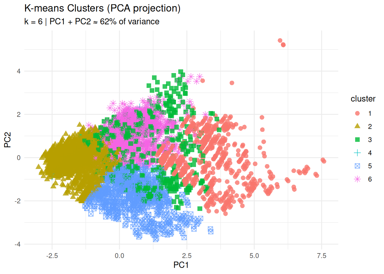
The separation of groups in the PC1–PC2 plane provides an initial visual assessment of cluster structure.
Step 6: Cluster profiles (centroid heatmap)
Centroid coordinates are expressed in z-score units, because the variables were standardized. Positive values indicate features above the overall mean, negative values features below the mean.
library(tidyr)
library(RColorBrewer)

centers_df <- data.frame(
  cluster = paste("Cluster", 1:k_final),
  round(pc_k6$centers, 2),
  row.names = NULL
)

centers_long <- centers_df |>
  pivot_longer(
    cols      = -cluster,
    names_to  = "feature",
    values_to = "zscore"
  )

ggplot(centers_long, aes(x = feature, y = cluster, fill = zscore)) +
  geom_tile(color = "white") +
  scale_fill_gradient2(
    low      = "blue",
    mid      = "white",
    high     = "red",
    midpoint = 0,
    name     = "Z-score"
  ) +
  theme_minimal() +
  theme(axis.text.x = element_text(angle = 45, hjust = 1)) +
  labs(
    title = "Cluster Profiles (Standardized Features)",
    x     = NULL,
    y     = NULL
  )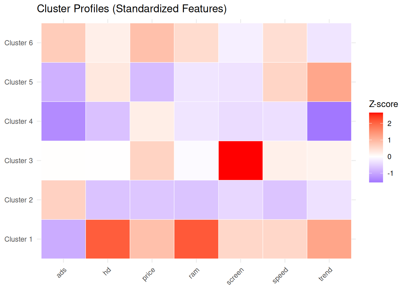
This representation facilitates assigning meaningful labels to each group (for example, “budget machines”, “high-performance workstations”, “premium configurations”, etc.) based on their feature profiles.
Step 7: Silhouette plot (per-observation validation)
## Silhouette of 6259 units in 6 clusters from silhouette.default(x = pc_k6$cluster, dist = dist(pc_scaled)) :
##  Cluster sizes and average silhouette widths:
##       612      2150       542       623      1014      1318
## 0.2512378 0.3565262 0.2100873 0.3204481 0.2907532 0.1873209
## Individual silhouette widths:
##    Min. 1st Qu.  Median    Mean 3rd Qu.    Max.
## -0.1274  0.1694  0.2884  0.2837  0.4054  0.5827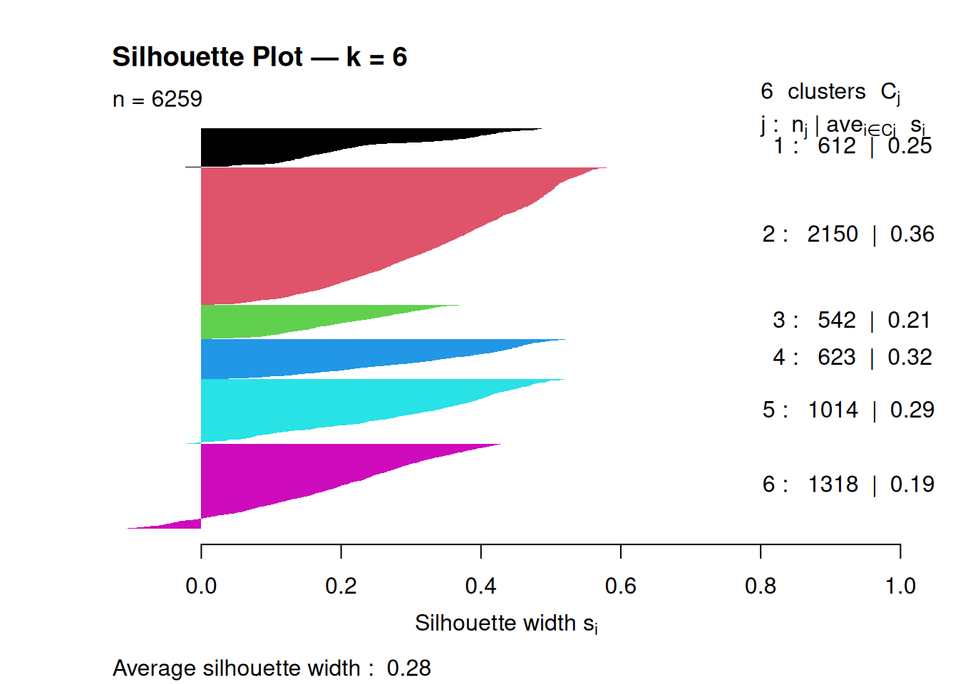
An average silhouette around 0.2–0.3 suggests moderate cluster separation; higher values indicate more clearly defined clusters.
Step 8: Stability analysis (reproducibility)
To evaluate clustering stability with respect to initialization, we compare partitions obtained with different random starts, using the Adjusted Rand Index (ARI) as a concordance measure between partitions.
library(mclust)

stability_check <- function(data, k, n_reps = 20, nstart = 50) {
  set.seed(123)
  ari_scores <- numeric(n_reps)

  for (i in 1:n_reps) {
    cl1 <- kmeans(data, centers = k, nstart = nstart)$cluster
    cl2 <- kmeans(data, centers = k, nstart = nstart)$cluster
    ari_scores[i] <- adjustedRandIndex(cl1, cl2)
  }

  mean(ari_scores)
}

stability_k6 <- stability_check(pc_scaled, k_final)
cat("Average ARI stability (k = 6):", round(stability_k6, 3), "\n")
## Average ARI stability (k = 6): 1Average ARI values close to 1 indicate highly reproducible clusterings across different random starts.
Best practices and warnings
- Always standardize variables when using k-means on features with different scales.
- Use a sufficiently large
nstart(for example, 25–50) to mitigate the impact of local minima. - Choose \(k\) by combining multiple criteria (elbow, silhouette, etc) rather than relying on a single index.
- Assess stability (e.g., via ARI) if clustering is used for decision-making or segmentation.
- Remember the implicit assumption of roughly spherical, equal-variance clusters; in the presence of elongated or density-based structures, consider alternative methods (for example, hierarchical or density-based clustering).
Summary
In this lesson you learned how to:
- Define k-means formally as minimization of WCSS.
- Select the number of clusters \(k\) using elbow, silhouette, etc.
- Interpret clusters via standardized centroids and PCA projections.
- Evaluate clustering quality and stability with silhouette plots and Adjusted Rand Index.
- Compare k-means with hierarchical clustering to check robustness of the discovered structure.
A work by Gianluca Sottile
gianluca.sottile@unipa.it