Scatter Plot in R using ggplot2 (with Example)
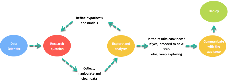
Graphs are a key part of data analysis and communication. A typical workflow includes:
- Defining a research question.
- Collecting, cleaning, and transforming data.
- Exploring patterns and refining hypotheses.
- Communicating results clearly to stakeholders.
Visualizations are often the fastest way to make complex ideas understandable.
The ggplot2 package
This lesson focuses on creating charts with ggplot2, which is based on Wilkinson’s Grammar of Graphics (2005). ggplot2 is flexible and supports many geoms, themes, and transformations, but it does not provide true 3D plots or interactive graphics out of the box.
A ggplot can be built from:
- Data
- Aesthetic mappings (
aes()) - Geometric objects (geoms)
- Statistical transformations (stats)
- Scales
- Coordinate systems
- Faceting
The basic syntax is:
Scatter plot
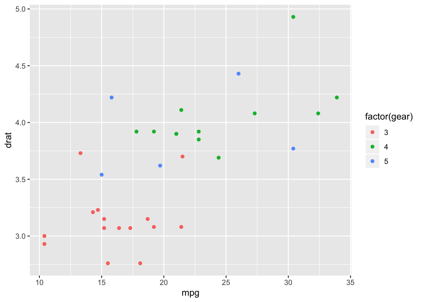
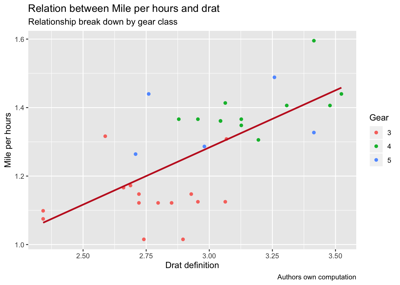
We will use mtcars and start with a simple scatter
plot.
Basic scatter plot
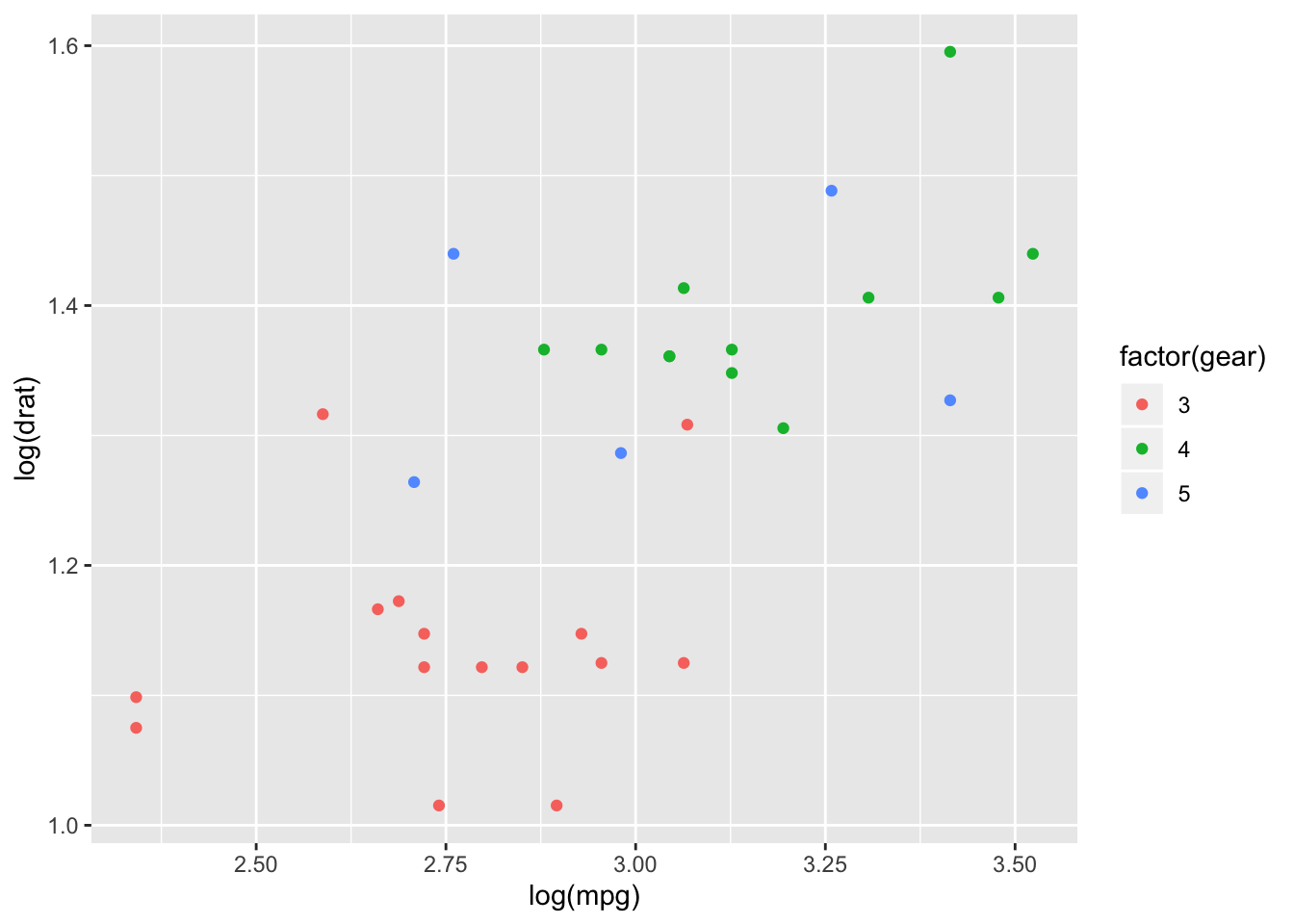
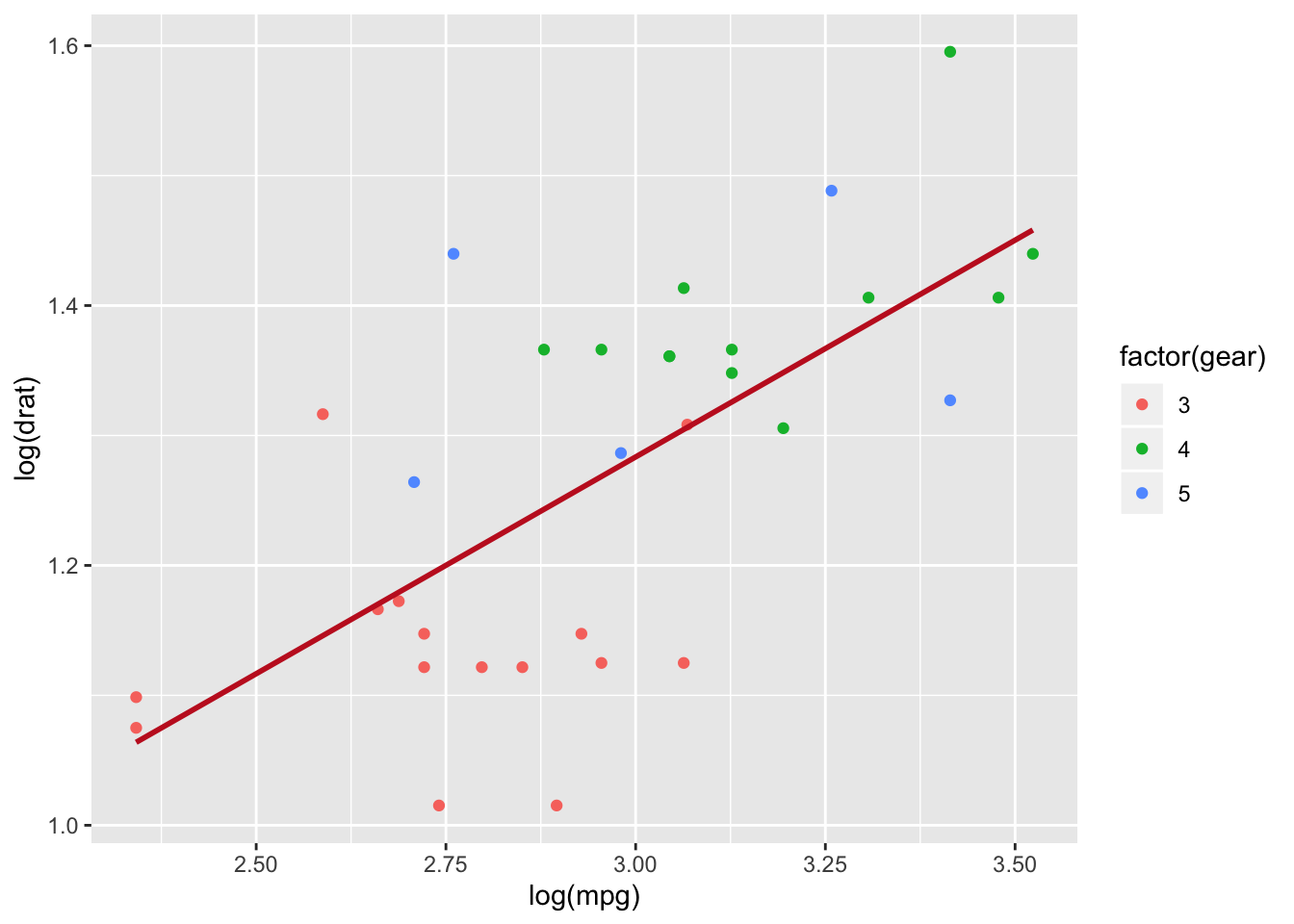
Add a fitted line
You can add a fitted regression line with
stat_smooth(method = "lm").
my_graph <- ggplot(mtcars, aes(x = log(mpg), y = log(drat), color = factor(gear))) +
  geom_point() +
  stat_smooth(
    method = "lm",
    se = FALSE,
    color = "#C42126",
    linewidth = 1
  ) +
  theme_classic() +
  labs(color = "Gears")

my_graph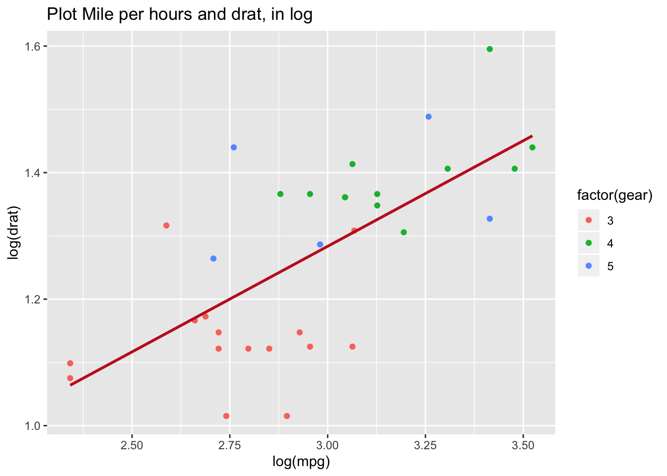
Make the plot informative
Good charts should be readable without extra documentation. Use
labs() to add titles and axis labels.
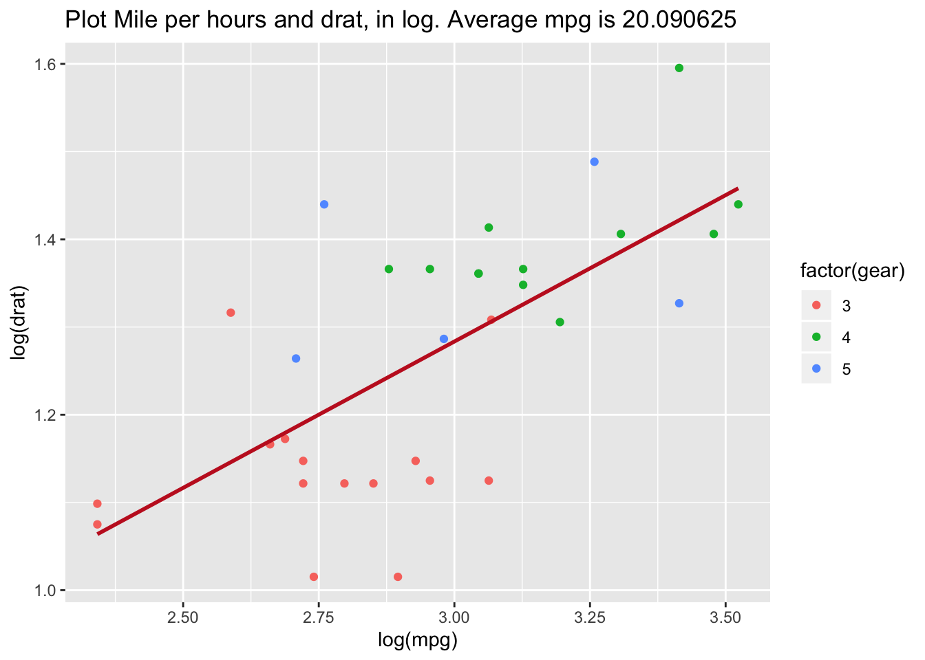
Dynamic title (example)
mean_mpg <- mean(mtcars$mpg)

my_graph +
  labs(
    title = paste("log(drat) vs log(mpg) — mean mpg:", round(mean_mpg, 2))
  )
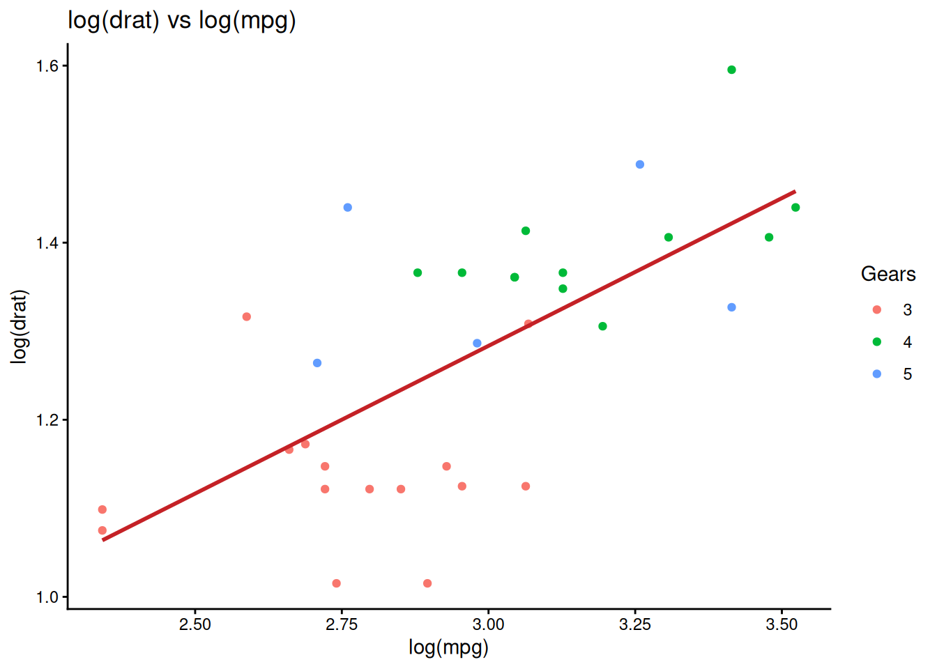
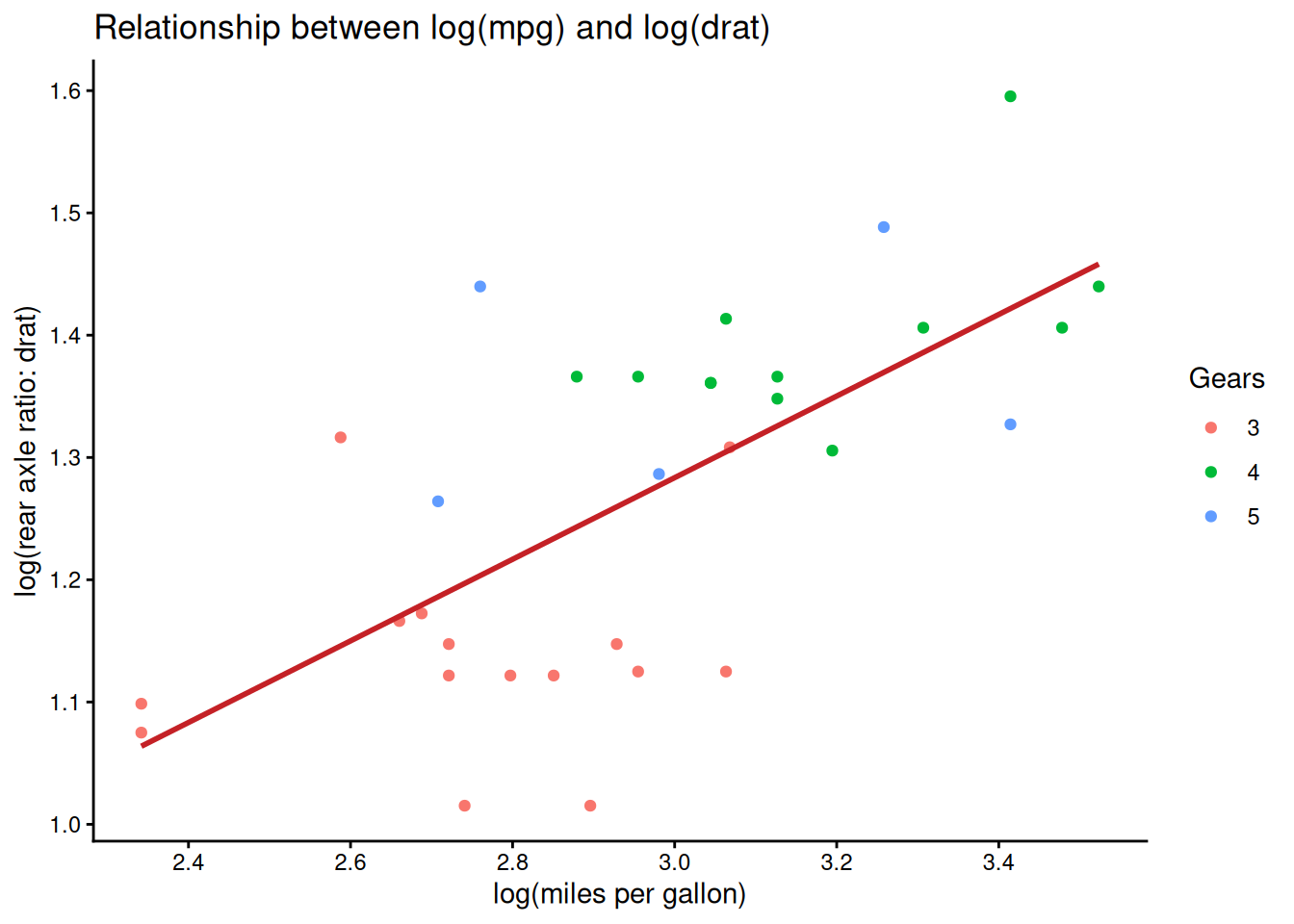
Control scales
You can control axis breaks with
scale_*_continuous(breaks = ...).
my_graph +
  scale_x_continuous(breaks = seq(1, 3.6, by = 0.2)) +
  scale_y_continuous(breaks = seq(0.6, 1.6, by = 0.1)) +
  labs(
    x = "log(miles per gallon)",
    y = "log(rear axle ratio: drat)",
    color = "Gears",
    title = "Relationship between log(mpg) and log(drat)"
  )
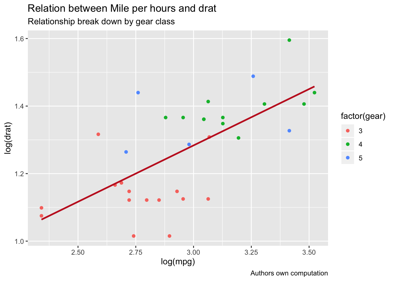
Themes
ggplot2 includes multiple themes; switching theme changes the overall style.
my_graph +
  theme_dark() +
  labs(
    x = "log(miles per gallon)",
    y = "log(rear axle ratio: drat)",
    color = "Gears",
    title = "Relationship between log(mpg) and log(drat)",
    subtitle = "Colored by gear class",
    caption = "Source: mtcars"
  )
Save plots
ggsave() saves a plot to disk; by default it saves the
last displayed plot, but it is safer to pass the plot explicitly.
## [1] "/home/runner/work/An-R-Tutorial-for-Beginners/An-R-Tutorial-for-Beginners"plot_to_save <- my_graph +
theme_dark() +
labs(
x = "log(miles per gallon)",
y = "log(rear axle ratio: drat)",
color = "Gears",
title = "Relationship between log(mpg) and log(drat)",
subtitle = "Colored by gear class",
caption = "Source: mtcars"
)
ggsave(
filename = "my_fantastic_plot.png",
plot = plot_to_save,
dpi = 300
)Note: opening a folder from R is OS-dependent; in many deployed environments (GitHub Actions, servers) it will not work, so it is usually better to rely on the printed path.
Summary
| Objective | Example |
|---|---|
| Basic scatter plot | ggplot(df, aes(x, y)) + geom_point() |
| Color by group | ggplot(df, aes(x, y, color = factor(g))) + geom_point() |
| Transform variables (log) | ggplot(df, aes(log(x), log(y))) + geom_point() |
| Add fitted line | … + stat_smooth(method = ‘lm’, se = FALSE) |
| Add labels (title/subtitle/caption) | … + labs(title = …, subtitle = …, caption = …) |
| Control axis breaks | … + scale_x_continuous(breaks = …) |
| Change theme | … + theme_classic()/theme_dark()/… |
| Save plot | ggsave(‘plot.png’, plot = p) |
A work by Gianluca Sottile
gianluca.sottile@unipa.it